| Image |
Comment |
| 03/25/2003 04:25:50 AM |
|
| 03/24/2003 08:19:28 PM |
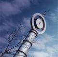
Stormy Timesby OneSweetSinComment by casualguy: When I starting looking over all the TIME entries, I was hoping to find some good examples that would pull off the challenge without using a 'clock'..... What I am finding is that the better photos (in most cases) include clocks of some kind. I can't fault those who took great shots with 'clock' subject matter now can I?
I find your choice of orientation and composition to be very pleasing and a nice departure. Nice job!
|
 Photographer found comment helpful. Photographer found comment helpful. |
| 03/24/2003 05:27:33 PM |
Stormy Timesby OneSweetSinComment by Jeileen: This would be really cool if the skies were cloudy and stormy looking. As the sky is - would have considered catching a different time.... |
| 03/24/2003 02:59:54 PM |
|
| 03/24/2003 10:37:26 AM |
|
| 03/23/2003 04:00:12 PM |
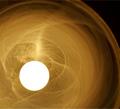
Body Part Number 1by OneSweetSinComment by timj351: Critique Club critique by Tim Jensen
To be honest this appears to be a photo that was entered at the last moment when you didn't have a better idea. I don't mean to be harsh but I just don't find this to be a very compelling photo. I feel it is borderline in meeting the challenge as well because you created the 1 shape yourself so it wasnt naturally occurring. But it's probably close enough. If you had to use your own hand then I think you should have tried to create a semi-abstract, compositionally strong image. Strong, contrasty light and maybe the use of black and white would have created a more visually appealing photo. There is interesting texture in the wall and more could have been done with that with some strong sidelighting. I hope this helps. It's all good practice and that is the main point of this site so I hope you can use this advice in a positive way.
Tim |
| 03/23/2003 02:17:19 PM |
|
| 03/23/2003 12:07:18 AM |
|
| 03/22/2003 09:19:17 PM |
|
| 03/21/2003 01:52:14 PM |
|
Home -
Challenges -
Community -
League -
Photos -
Cameras -
Lenses -
Learn -
Help -
Terms of Use -
Privacy -
Top ^
DPChallenge, and website content and design, Copyright © 2001-2026 Challenging Technologies, LLC.
All digital photo copyrights belong to the photographers and may not be used without permission.
Current Server Time: 05/31/2026 09:59:24 AM EDT.