| Image |
Comment |
| 08/18/2003 11:10:49 AM |
Waiting and Watchingby OneSweetSinComment by justesme: That is a brilliant silhoette of the little child. But personally, I would have much preferred a close crop of the boy cutting out the rest of the landscape and the wooden deck, because I think that they are a little distracting, and the reflections immediately tell you it is a sunset/rise without the actual sun.
Also, the deck looks a little wonky with the straight horizon, so it's a little offputting.
=) |
 Photographer found comment helpful. Photographer found comment helpful. |
| 08/17/2003 11:54:56 PM |
|
| 08/16/2003 06:54:36 PM |
|
| 08/14/2003 08:56:34 PM |
"W"by OneSweetSinComment by e301: Hi again Anna - more critique fun.
Immediate impression - it seems soft-focussed, and feels not quite horizontal. The soft-focus thing is really quite bizarre though: looking at the shadow lines, and the top edge, it seems plenty sharp enought there - so i think it must be the tonality of the panels and the glass that give it. As to the horizontal - I'd have to measure it: on closer inspection sometimes it looks OK, and sometimes off.
Obviously meets the challenge - no issues there.
It doesn't have much impact for me: the way the centre part of the building appears to continue into the relection is pretty effective - approaches timmi's shot that placed 3rd - but isn't emphasised by the composition, or the light. The subject is plainly, and not just because of the title, the line of the top of the building; and whilst it's clear that that is right angles, perhaps it would have been more effective if it had been a genuine right angle on screen: I think that might have looked quite striking.
Still, 5.6 is not a bad finish.
Ed |
| 08/14/2003 05:03:13 PM |
|
| Photographer found comment helpful. |
| 08/14/2003 02:31:49 PM |
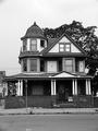
Forgotten Beautyby OneSweetSinComment by Pidd: This is a nice real estate shot, but it does not give the feeling of desolation to me. Except for the few bits of graffiti that are barely noticeable, it seems more like a coveted piece of real estate than an old, delapitated home. |
| 08/14/2003 09:58:39 AM |
|
| 08/14/2003 07:35:06 AM |
|
| 08/13/2003 11:03:35 AM |
|
| 08/13/2003 08:28:49 AM |
|
| Photographer found comment helpful. |
Home -
Challenges -
Community -
League -
Photos -
Cameras -
Lenses -
Learn -
Help -
Terms of Use -
Privacy -
Top ^
DPChallenge, and website content and design, Copyright © 2001-2026 Challenging Technologies, LLC.
All digital photo copyrights belong to the photographers and may not be used without permission.
Current Server Time: 06/03/2026 06:14:37 AM EDT.