| Image |
Comment |
| 02/06/2008 12:12:44 AM |
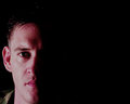
Hatby cryingdragonComment by Louis: Nothing too much to be said about the light, except maybe the demonic catchlights taking out the pupils and a slightly flat look, though it could be argued this is a fine example of a kind of "butterfly" lighting, but that's usually more suited to pretty and delicate faces which, I'm sorry to tell you, you ain't got. ;-) I think technically the lighting is good, particularly considering you're wearing a visor over your eyes and they're well lit. You're not separated from the background at all, which is a big minus for me. In my view some context in the form of texture and shadows or shaped light back there is needed. The pose is great. |
 Photographer found comment helpful. Photographer found comment helpful. |
| 02/05/2008 11:41:01 PM |
Hatby cryingdragonComment by dwterry: Well lit. Nice pose with the body angled away from the camera. Well done. |
| Photographer found comment helpful. |
| 02/05/2008 11:35:18 PM |
|
| Photographer found comment helpful. |
| 02/05/2008 09:35:32 PM |
Hatby cryingdragonComment by JamesKW: Work on them creases and clean that hat:) Nice work Mike. Focus on your eyes could be better. The lighting is good. Have fun with your exercise. Sorry, still don't miss it. |
| Photographer found comment helpful. |
| 02/05/2008 09:32:40 PM |
|
| Photographer found comment helpful. |
| 02/05/2008 08:20:22 PM |
Hatby cryingdragonComment by TCGuru: Your left eye is a little shadowed, but minor detail IMO... your light is not flat, and that is a good thing... I still would like to see a lil light on the bg, just to show that you aren't floating in the abyss... You might find this interesting. Apologies if you have seen it before :) |
| Photographer found comment helpful. |
| 02/05/2008 08:18:04 PM |
Hatby cryingdragonComment by littlegett: Getting your way is what its all about L()L. Nice clean portrait and balance of shadows/light. It can sometimes be very difficult when there is a brim covering the eyes. Nice work. |
| Photographer found comment helpful. |
| 02/05/2008 05:07:22 PM |
Beatby cryingdragonComment by bs-photos: The red tones seem a little strong to me, I like the lighting & use of negative space. |
| Photographer found comment helpful. |
| 02/05/2008 12:01:29 AM |
Beatby cryingdragonComment by awpollard: Interesting use of negative space. I like it. I do agree with the comment about a little more space on the left (but not much). |
| Photographer found comment helpful. |
| 02/04/2008 11:16:31 PM |
Beatby cryingdragonComment by daboardergirl: I very much like the lighting. I do think a little more space on the left would be nice. Good luck for having a better day tomorrow. :) |
| Photographer found comment helpful. |
Home -
Challenges -
Community -
League -
Photos -
Cameras -
Lenses -
Learn -
Help -
Terms of Use -
Privacy -
Top ^
DPChallenge, and website content and design, Copyright © 2001-2026 Challenging Technologies, LLC.
All digital photo copyrights belong to the photographers and may not be used without permission.
Current Server Time: 07/16/2026 02:28:13 PM EDT.