| Image |
Comment |
| 08/04/2008 05:36:21 PM |
It's Not Always So Black & Whiteby EyesupComment by Love6: really interesting composition and use of desaturation; she seems somewhat uncertian; and the expression is very pretty- I wonder what some dodging and burning on the mirror frame would do? (improve or wreck the image?) its rather artistic and nice as is IMO :) |
| 08/04/2008 01:41:05 PM |
|
 Photographer found comment helpful. Photographer found comment helpful. |
| 08/03/2008 07:55:31 AM |
|
| 08/02/2008 05:30:10 AM |
|
| Photographer found comment helpful. |
| 06/12/2008 09:12:01 AM |
Mothers Loveby EyesupComment by toddhead: Personally, I think this is a fantastic photograph. I know everyone seems to think it is too blown out, but I love it. You should be very proud of this one. |
| Photographer found comment helpful. |
| 04/23/2008 11:55:27 AM |
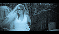
Bridal Blueby EyesupComment by vxpra: Color balance aside I don't care for the photo. I don't think the setting really works for a bridal shoot. The background is cluttered and my eye was drawn directly to the chunk of plywood leaning against the fence. Then I start to notice the small brances protruding into the bride. Finally, the black border on the top and bottom just doesn't work for me. The bride herself is good. You've captured a really good expression, she seems very relaxed with you (which is a real positive in any portrait). |
| 04/23/2008 10:17:24 AM |
City: From the Other Sideby EyesupComment by talmy: The white (now black) roof is distracting, as is the probable bird dropping on the tombstone. Also the whole shot seems blurred. Nothing is truly sharp. I'd have gone with a smaller aperture and also apply more USM at the end. People like sharpened (even oversharpened) images here. |
| 04/23/2008 10:09:50 AM |
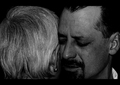
Raw Emotionby EyesupComment by talmy: It may be the close crop or the angle, but I can't get away from seeing this as two pictures photoshopped together. The mother and son don't appear to be together but the mother looks pasted onto a picture of the son. Dark shots are also risky since many people don't have calibrated monitors and may not be seeing the low levels. |
| 04/23/2008 10:05:19 AM |
Bridal Blueby EyesupComment by talmy: Looks ghoulish. Not exactly what one wants to see in a bridal portrait. And what is the point of the right half of the frame? It would be much better cropped to just the bride. |
| 04/23/2008 09:43:29 AM |
City: From the Other Sideby EyesupComment by Yo_Spiff: I didn't vote on negative image, or I would tell you what I gave this. My initial impression is that the main subject is shoved way too far over in the corner, which akes the eye gravitate toward the out of focus buildings in the background. The other thing I think is that the use of the negative image does not seem to add anything to the image. |
| Photographer found comment helpful. |
Home -
Challenges -
Community -
League -
Photos -
Cameras -
Lenses -
Learn -
Help -
Terms of Use -
Privacy -
Top ^
DPChallenge, and website content and design, Copyright © 2001-2026 Challenging Technologies, LLC.
All digital photo copyrights belong to the photographers and may not be used without permission.
Current Server Time: 04/02/2026 02:07:14 AM EDT.