| Image |
Comment |
| 02/02/2003 09:12:17 PM |
|
| 02/02/2003 02:47:35 PM |
|
| 02/02/2003 02:31:08 PM |
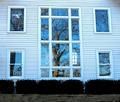
Sudley Church Windowsby 3boyzMomComment by lisae: Interesting reflections. The composition is strong, but the photo overall seems a bit flat to me. The colours are nice though. |
| 02/02/2003 01:49:12 PM |
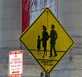
Kennedy Crossing Washington DCby 3boyzMomComment by jmsetzler: Greetings from the Critique Club :)
I particularly like the crosswalk sign in this image. It's off-center composition seems to work really well. I also consider that sign to be the 'subject' of this shot. That being the case, the 'no standing or parking' sign seems to be creating a minor problem for me. It is catching some light from somewhere that is making it much brighter than your 'subject' sign. I'm not sure if these two signs are supposed to be related in some way... I can't see it though.
Unfortunately, I believe that the banner behind the crossing sign is also somewhat distracting from the composition as well. I can't really offer any suggestions for improvement on this image. Not knowing the environment, I would not want to try to suggest different angles. There is probably a lot of clutter looking from other perspectives on this sign...
John Setzler
|
| 01/31/2003 08:42:53 PM |
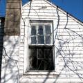
Square in disrepairby 3boyzMomComment by Bullwinkle: A good idea. The crackle of branch shadows add to the psychological depth of your image. As my choice I would like to wave a magic wand and get closer to eliminate the sky and chimney as the story is told by the windows themselves. Only a suggestion to your worthy moment of inspiration. |
| 01/31/2003 02:37:53 PM |
Sudley Church Windowsby 3boyzMomComment by LindaLee: The bushes in this shot really detract from it for me. I would have loved a nice tight crop surrounding all the windows and really showcasing them. The reflections of the trees are wonderful and provide so much interest. The overall color on my monitor is blue, and I'm wondering if it was your white balance, or if possbly that color cast could have been removed in PS or a similar progra. I think if the building was more of a nice stark white, it would have provided a wonderful contrast and really made the photo "pop". Then again, maybe I'm completely off base and the building IS blue!! |
| 01/30/2003 04:50:39 PM |
Square in disrepairby 3boyzMomComment by PTLParsons: Ahhhhh. The beauty of the old buildings. I love it. I'm so glad you did it in color also. That beautiful blue sky against the rool line is georgeous. I love the shadows of the tree limbs, they add mystic to the photo. Looks like someone might have started to fix it up, and gave up. There's a story here. Really great photo. Love it. |
| 01/30/2003 02:47:02 PM |
|
| 01/30/2003 02:13:30 PM |
|
| 01/30/2003 01:03:40 AM |
|
Home -
Challenges -
Community -
League -
Photos -
Cameras -
Lenses -
Learn -
Help -
Terms of Use -
Privacy -
Top ^
DPChallenge, and website content and design, Copyright © 2001-2026 Challenging Technologies, LLC.
All digital photo copyrights belong to the photographers and may not be used without permission.
Current Server Time: 07/15/2026 07:18:34 PM EDT.