| Author | Thread |
|
|
02/06/2003 10:41:04 PM |
...from Critique Club...
Hi Tracy :)
FIRST IMPRESSION:
Really nice contrast!
COMPOSITION:
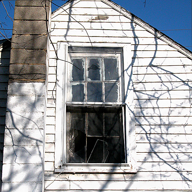
I like the way you tried to get some of the sky to contrast with the house....but I really wish there was more sky. The fact that you cut off the tip of the house, IMO, takes from the beauty of the photo. I would even try to get the entire chimney in as well. Other than that, I think the angle you shot it at is very interesting :|
TECHNICAL:
Nice and sharp photo. Maybe a bit over exposed. Sky looks very deep and real. :)
ARTISTIC:
I think it's worth going back and shooting some more, as this house looks really neat (you probably did take more shots). I think closing in on the windows would have been better for this challenge. :|
OVERALL:
A nice a sharp photo that would have done better with a diff comp.
Cheers and good luck in the future challenges. |
|
Comments Made During the Challenge  |
|
|
02/02/2003 09:12:17 PM |
|
old things are beautiful, love the shadows too. |
|
|
|
02/02/2003 02:47:35 PM |
|
the shadows on the house from the tree branches add to the feeling of a place unkempt. nice eye. |
|
|
|
01/31/2003 08:42:53 PM |
|
A good idea. The crackle of branch shadows add to the psychological depth of your image. As my choice I would like to wave a magic wand and get closer to eliminate the sky and chimney as the story is told by the windows themselves. Only a suggestion to your worthy moment of inspiration. |
|
|
|
01/30/2003 04:50:39 PM |
|
Ahhhhh. The beauty of the old buildings. I love it. I'm so glad you did it in color also. That beautiful blue sky against the rool line is georgeous. I love the shadows of the tree limbs, they add mystic to the photo. Looks like someone might have started to fix it up, and gave up. There's a story here. Really great photo. Love it. |
|
|
|
01/30/2003 02:47:02 PM |
|
I love the shadows in this photo. They move your eyes along the house. |
|
|
|
01/30/2003 02:13:30 PM |
|
Photograph looks cool but I don't think it is very original. |
|
|
|
01/30/2003 01:03:40 AM |
|
Not pleasent to look at. But only because you captured the "despair" so well. |
|
|
|
01/29/2003 02:44:14 PM |
|
I think tha5t the light ing that was used was used very nicely. I think that by focusing in more on the window and creating more focus on that would have created much more intrest to your picture. Nice Work |
|
|
|
01/29/2003 02:41:10 PM |
|
I like how you used the old window. Dont use the top of the house because it is more of a triangle than a square. |
|
|
|
01/28/2003 12:16:19 PM |
|
Cute title, great shadows, light. |
|
|
|
01/27/2003 08:15:41 PM |
|
noise in the sky. I like the shadows of the branchs, and the vantage point you used. |
|
 Photographer found comment helpful. Photographer found comment helpful. |
|
|
01/27/2003 10:17:55 AM |
|
Whooo, not a square! I'm sure everyone has commented on this. I really love the composition of your photo, and I always enjoy photos of decaying buildings. The shadows from the winter-bare tree really add to the sense of despair in this shot. It's a lovely shot, but I fear you are not going to fare well because of the rectangle issue... |
|
| Photographer found comment helpful. |
|
|
01/27/2003 02:47:57 AM |
|
It's nice but I think the pic is over exposed... no expert and would like to see other opinions on this.. Just my gut feeling. |
|
| Photographer found comment helpful. |
|
|
01/27/2003 01:28:16 AM |
|
Catchey title, photo is too simple |
|
Home -
Challenges -
Community -
League -
Photos -
Cameras -
Lenses -
Learn -
Help -
Terms of Use -
Privacy -
Top ^
DPChallenge, and website content and design, Copyright © 2001-2026 Challenging Technologies, LLC.
All digital photo copyrights belong to the photographers and may not be used without permission.
Current Server Time: 06/29/2026 02:56:53 PM EDT.