| Image |
Comment |
| 02/10/2003 10:53:41 AM |
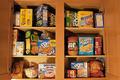
I Spy...by 3boyzMomComment by FranziskaLang: challenge met. what a great idea! :) i like the little cut-out photo. i also like the mixture of colors and shapes in your pantry, they make the photo just as busy as many of the waldo pictures. the only thing i would suggest is to try and shoot this head on (you have a perspective shot here, too), and crop tighter around the shelves, i would've even tried to crop so that you don't see where they end. |
 Photographer found comment helpful. Photographer found comment helpful. |
| 02/10/2003 09:38:52 AM |
|
| 02/10/2003 03:06:52 AM |
I Spy...by 3boyzMomComment by Kate: Wow, there is a bit of American Food Culture! Fun shot--I like it. Maybe it could be a tad brighter? |
| Photographer found comment helpful. |
| 02/09/2003 11:55:57 PM |
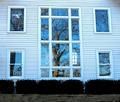
Sudley Church Windowsby 3boyzMomComment by Annida: Greetings from the Critique Club!
Composition is pretty good, I like the symmetry very much! What I don't like is how flat it looks. Probably because of the angle you took the photo from. I guess that's ok because you would have ended up in the photo yourself! Did you try more from the side, and up a bit so you could get some more perspective in the shot?
I like how the tree is reflected in the windows. I wouldn't change that. The overall feel of the photo is a bit cold because of the blue'ness of the photo; I will give you the benefit of the doubt and say you were trying to emit how cold it was that day :)
My opinion of the picture is that I like your idea, but a different angle with more perspective would have worked just as well, if not better than straight on. I think your score was very good too! I hope to see many more of your work in the future! Good luck in the next challenges :) |
| 02/09/2003 05:23:31 PM |
|
| 02/09/2003 09:50:39 AM |
Some Like 'Em Ripeby 3boyzMomComment by lisae: Lovely tight shot. The composition of this is great, I love how all the bananas kind of spiral out from one point. The lighting is nice, and I love the bright yellow colours. |
| 02/07/2003 09:53:42 PM |
|
| 02/07/2003 08:17:36 AM |
Bearly an Angel!by 3boyzMomComment by PTLParsons: Too tightly cropped. The cross on the right side fits the photo well but can hardly been seen. In fact being as dark as it is, it is really a distraction. It's like a part of the background that shouldn't be there, as is the wall or whatever it is leaning against. Instead you should have made the background solid white. Either have it in, clearly visible or totally out. Sounds like I'm saying I don't like the photo, but it is just the opposite. I really do, or would, if this was changed. I really like close ups except when they chop up the subject. Zoom out some and add a little light and this is beautiful. |
| 02/06/2003 10:41:04 PM |
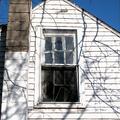
Square in disrepairby 3boyzMomComment by zadore: ...from Critique Club...
Hi Tracy :)
FIRST IMPRESSION:
Really nice contrast!
COMPOSITION:
I like the way you tried to get some of the sky to contrast with the house....but I really wish there was more sky. The fact that you cut off the tip of the house, IMO, takes from the beauty of the photo. I would even try to get the entire chimney in as well. Other than that, I think the angle you shot it at is very interesting :|
TECHNICAL:
Nice and sharp photo. Maybe a bit over exposed. Sky looks very deep and real. :)
ARTISTIC:
I think it's worth going back and shooting some more, as this house looks really neat (you probably did take more shots). I think closing in on the windows would have been better for this challenge. :|
OVERALL:
A nice a sharp photo that would have done better with a diff comp.
Cheers and good luck in the future challenges. |
| 02/05/2003 09:59:51 PM |
|
Home -
Challenges -
Community -
League -
Photos -
Cameras -
Lenses -
Learn -
Help -
Terms of Use -
Privacy -
Top ^
DPChallenge, and website content and design, Copyright © 2001-2026 Challenging Technologies, LLC.
All digital photo copyrights belong to the photographers and may not be used without permission.
Current Server Time: 07/16/2026 09:06:39 AM EDT.