| Image |
Comment |
| 10/01/2006 06:27:42 PM |
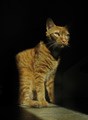
Wallyby FromacComment by butch81385: I am not really a cat person, but I do love the lighting on this one. I only wish that the cat's front left paw wasn't half in shadowand maybe more light towards the back of the cat. Also, in my opinion the lighting is a little bland and does not show the brilliance of the fur as much as could be done. Still, I love the pose and lighting and give it a 7. |
 Photographer found comment helpful. Photographer found comment helpful. |
| 10/01/2006 03:55:32 PM |
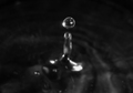
Plop!by FromacComment by pcody: These have been done so many times that the bar has been raised very high. It is almost impossible to get a decent score unless the shot is perfect. I salute the attempt that was made. This seems to be out of focus and overprocessed.
Seeing that there were at least 3 light sources, I wonder if a flash was tried. That would allow for a higher shutter speed but should only be used as an external flash that could be positioned away from the camera to avoid all the hot spots on the front of the drop. |
| Photographer found comment helpful. |
| 10/01/2006 09:51:44 AM |
|
| Photographer found comment helpful. |
| 10/01/2006 09:42:40 AM |
Wallyby FromacComment by mist: Great texture on the coat, clever use of light. |
| Photographer found comment helpful. |
| 09/28/2006 06:59:34 PM |
Plop!by FromacComment by lynnmarie: Seems to have a bit too much glare. Maybe brighten the photo and add some color. |
| Photographer found comment helpful. |
| 09/28/2006 09:29:35 AM |
|
| Photographer found comment helpful. |
| 09/27/2006 10:42:38 PM |
|
| Photographer found comment helpful. |
| 09/27/2006 06:44:03 PM |
Plop!by FromacComment by Photonurd: Beautiful shot, just lost the focus a bit. Maybe a smaller aperture next time to get everything in focus? 8o) |
| Photographer found comment helpful. |
| 09/27/2006 02:05:42 PM |
Plop!by FromacComment by Nuzzer: A unique slant on the obligitory water-drop shot in that most of it is blurred - that makes this score higher |
| Photographer found comment helpful. |
| 09/26/2006 09:38:07 AM |
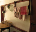
Country Kitchenby FromacComment by Germaine: Very good light and elements, but IMNSHO it would benefit from some cropping. I would crop out the cabinet door on the right side. It's so dark it draws your eye out of the picture, and it's wider at the bottom than the top -- very distracting. I'd crop a tad off the bottom to get rid of that little triangle of something -- either that or clone the triangle out. On the left, I'd shave off that little strip of wall and have the margin of the picture, flush with the wood doorframe. I think getting rid of these extraneous elements would give you a stronger composition and draw attention to the play of light on the towels, walls, and things on the table. |
| Photographer found comment helpful. |
Home -
Challenges -
Community -
League -
Photos -
Cameras -
Lenses -
Learn -
Help -
Terms of Use -
Privacy -
Top ^
DPChallenge, and website content and design, Copyright © 2001-2026 Challenging Technologies, LLC.
All digital photo copyrights belong to the photographers and may not be used without permission.
Current Server Time: 07/17/2026 12:34:13 PM EDT.