| Image |
Comment |
| 02/10/2003 02:24:46 PM |
|
 Photographer found comment helpful. Photographer found comment helpful. |
| 02/10/2003 01:04:14 PM |
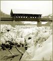
Waldo's Creekby DJLubaComment by JPR: Lovely photo. I like the choice of tones and love the contrast. The background in particular is so soft and misty and the bridge is hard and rough and pops out nicely. The person is well hidden, although I knew exactly where to look to find them. I would have moved them somewhere to the side of the bridge or maybe lying in the snowpiles on the middle left or under the bridge. Great job! |
| Photographer found comment helpful. |
| 02/10/2003 09:59:16 AM |
|
| Photographer found comment helpful. |
| 02/10/2003 02:19:05 AM |
|
| Photographer found comment helpful. |
| 02/09/2003 11:21:30 PM |
Gratuitous Splashby DJLubaComment by mcrael: Nice capture of water motion. Photo is a little dark - would prefer to see more contrast between the glass's stem and the background. |
| Photographer found comment helpful. |
| 02/09/2003 10:00:02 PM |
Rolling the Diceby DJLubaComment by timj351: Critique Club critique
I'm a little late on this, sorry.
The first thing that stands out for me is the slight blurriness to some of the die. It is in that borderline state where I think it should be even blurrier or not blurry at all. Brighter lights, a smaller aperture, and/or a faster shutter speed would have helped. Overall I think it is pretty well done and shows a good amount of creativity and execution. The composition is nice and simple which is appropriate. These kind of shots usually have a black background, which is fine, but I'm wondering if something else could have worked even better like some subtle design or gradient. I'm not sure, though. You made a good choice in choosing the dice. The transparency adds some more detail and interest. The uneven lighting is like the blurriness where I would rather see it even more uneven or more evenly lit. I like the brilliance in the color on the top dice and would like to see that same brilliance on the rest of the dice. It looks nice and clean and the coloring looks good. For the most part, a nice job.
T |
| 02/09/2003 08:43:51 PM |
|
| 02/09/2003 07:39:39 PM |
|
| Photographer found comment helpful. |
| 02/09/2003 01:12:04 AM |
|
| 02/07/2003 09:41:00 AM |
Gratuitous Splashby DJLubaComment by inspzil: Nice color. Crystal clear pic too. I don't know if I like the big splash. Great shot of it though - Inspzil |
Home -
Challenges -
Community -
League -
Photos -
Cameras -
Lenses -
Learn -
Help -
Terms of Use -
Privacy -
Top ^
DPChallenge, and website content and design, Copyright © 2001-2026 Challenging Technologies, LLC.
All digital photo copyrights belong to the photographers and may not be used without permission.
Current Server Time: 07/16/2026 09:06:33 AM EDT.