|
|
|
Showing 211 - 220 of ~398 |
| Image |
Comment |
| 06/12/2003 12:21:25 AM | |
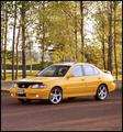
| 06/11/2003 09:13:23 PM | Sport Compact Carby RefractedComment by crabappl3: Nice looking car. I like that you have the fog lights on. I would think that with a car shot for a magazine, you would want to get a lower camera angle and closer crop so as to make the buyer of the magazine to want to buy the magazine. With this angle it looks like you parked in a nice area, got out and snapped a shot. If you're gonna do a higher angle, then a step ladder so you can get roof line would help. Technically, nothing wrong with the shot, just doesn't have the spark to scream magazine cover shot. 7 -danny |  Photographer found comment helpful. Photographer found comment helpful. |
| 06/11/2003 05:48:20 PM | Sport Compact Carby RefractedComment by buzzrock: Im a ford focus driver myself, 2003 ZX5-- Only Mod so far Diablo Sport Chip, but anyway..
Excellent Light and background, and believable as a Cover Picture---8 | | Photographer found comment helpful. |
| 06/11/2003 05:19:20 PM | | | Photographer found comment helpful. |
| 06/11/2003 12:12:45 PM | Sport Compact Carby RefractedComment by rj324: I would have preferred if you did panning on this car or an open space with no distractions like the trees behind. | | Photographer found comment helpful. |
| 06/11/2003 11:59:47 AM | Sport Compact Carby RefractedComment by CLarson557: I can definately see this on a auto magazine cover. The background is beautiful and goes well with the yellow of the car. Technically well done and I like the angle at which you took this. Good luck in the challenge. 9 | | Photographer found comment helpful. |
| 06/11/2003 06:32:50 AM | | | Photographer found comment helpful. |
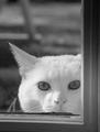
| 06/10/2003 04:39:55 PM | It's my home too.. let me in..by RefractedComment by ursula: FROM THE CRITIQUE CLUB
Hello, Andre,
IMO, this was the best pet picture in the Home Sweet Home challenge. To me personally pets do not speak of home, but this picture does - the cat looking through the door-window, trying to get in, that's home.
The composition and the choice of BW are excellent. I love how you framed the picture on two sides with the doorframe. Also, the way you see only part of the cat's face, and only one ear, is beautiful. The cat's eyes are very good. IMO, the photo does not need a mat or frame, it stands quite nicely on its own.
Focus is excellent. The blurred background looks totally appropriate here. The soft lighting works well here. There's only one place where I can see black, the pupils of the cat's eyes. The white fur sets off the eyes beautifully. The rest is various shades of grey.
I've been looking at your edited picture, and I think you're right - it probably would make a better print. You did a good job of editing. But I do not find the spots on the original unattractive - they tell me it was a rainy day, the edited photo is more "bland" in a way.
Anyway. I don't really have a suggestion for improvement, so I guess I'll say - "Keep up the good work". Take care,
Ursula (uabresch)
Questions, comments, complaints ... feel free to contact me. | | Photographer found comment helpful. |
| 06/09/2003 09:54:59 AM | |
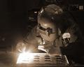
| 06/08/2003 11:55:17 PM | Flashby RefractedComment by HBunch: *Critique Club*
Love the way the weld light glows like that. I think this is perfect for this challenge. The overall darkness matches really really well with the bright light.
The angle and framing/cropping is great in my opinion. I really like how you have gotten all of him in the photo. The rigt edge is darkened enough, that you haven't actually chopped off the elbow, but rather it is lost in the darkness, which is nice.
Focus and clarity are really great as well. I love the detail in the hands, the patch on the uniform, and just the overall shot.
I think that the item in the back by his head is a slight bit of a distraction, however, not really that bad, as the main focus is the light really, and the hands, and had I not been TRYING to look at the entire image, I might not have even noticed it. So I don't really think it's a huge deal. LoL at the pepsi ad. You may have to edit those out if you use this in a company flyer. I see so many things where people bleep out the brand names on things because of advertizing issues. Anyway. Great shot.
~Heather~ | | Photographer found comment helpful. |
|
Showing 211 - 220 of ~398 |
Home -
Challenges -
Community -
League -
Photos -
Cameras -
Lenses -
Learn -
Help -
Terms of Use -
Privacy -
Top ^
DPChallenge, and website content and design, Copyright © 2001-2026 Challenging Technologies, LLC.
All digital photo copyrights belong to the photographers and may not be used without permission.
Current Server Time: 07/16/2026 05:02:08 AM EDT.
|