| Image |
Comment |
| 12/28/2007 12:56:20 PM |
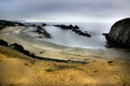
2406.jpgby aliquiComment by Yo_Spiff: There is a slight curve to the horizon, which I'd straighten. To me it disrupts the flow of the shot. That cut off rock on the right overpowers the smaller ones to some extent. It's a nice image, though I think a tighter crop might do well for it also. I'd be interested in seeing some other results with the same image. |
 Photographer found comment helpful. Photographer found comment helpful. |
| 12/28/2007 06:11:26 AM |
2406.jpgby aliquiComment by Tez: First off, I like the colours. I like how there's a gradient from the ochre shade to the steel-blue of the sky at the top, that isn't much to do with you but mroe fo the scene you captured.
As for composition: I think you did a good job as it represents the scene well, and since i've never been there, looks like a decent enough viewpoint. I can't help thinking maybe if you were lower down it would look cooler, or if you were nearer to those rocks in the water, or EVEN if you stood in the water in between those 2 channels of rocks and saw what was down there... nevertheless, I like it.
Thing that bothers me is the dodge/burn going on, it's too obvious and makes it look mottled in parts and underexposed in others. Burning has a tendency to dull things and dodging has a tendency to shift colours. I think if you did it on a seperate layer, changed the mode to 'luminosity' (doesn't alter colour info) and maybe reduced the opacity... or even if you made a new layer, painted solid black/white on the bits you wanted to darken/lighten and then set a guassian blur at high strength to blend it in, it would look better and more natural.
But having said all that, I like it, I like the almost square crop and the leading lines to the distant shore. Maybe a bit mroe contrast, or better yet, put it in B&W! |
| Photographer found comment helpful. |
| 12/26/2007 10:02:54 AM |
|
| Photographer found comment helpful. |
| 12/26/2007 01:28:40 AM |
Last Kiss... by aliquiComment by jschro: The color seems off to me....Maybe would have been better with the traditional silver foil. |
| Photographer found comment helpful. |
| 12/05/2007 12:08:47 PM |
|
| Photographer found comment helpful. |
| 12/03/2007 01:30:58 AM |
|
| Photographer found comment helpful. |
| 12/03/2007 01:04:43 AM |
What?? He was like that when I found him!by aliquiComment by levyj413: Hi. I'm responding to your request for comments in a thread. I think the score is about right. The flash creates some pretty strong shadows while also throwing the head into too-bright, flat light. Also, the composition doesn't draw me in. Both of those are personal taste, of course. |
| Photographer found comment helpful. |
| 12/02/2007 01:54:39 PM |
|
| Photographer found comment helpful. |
| 11/30/2007 12:08:40 AM |
|
| Photographer found comment helpful. |
| 11/29/2007 11:44:40 AM |
|
| Photographer found comment helpful. |
Home -
Challenges -
Community -
League -
Photos -
Cameras -
Lenses -
Learn -
Help -
Terms of Use -
Privacy -
Top ^
DPChallenge, and website content and design, Copyright © 2001-2026 Challenging Technologies, LLC.
All digital photo copyrights belong to the photographers and may not be used without permission.
Current Server Time: 07/16/2026 08:10:54 PM EDT.