| Image |
Comment |
| 02/03/2003 02:37:08 PM |
|
 Photographer found comment helpful. Photographer found comment helpful. |
| 01/18/2003 05:25:59 PM |
Bluesy Revolutionby RavenComment by teachme53: What a precious little girl... The lighting on your subject is very good. The point of view of shooting down creats a more creative image and the background makes for a nice contrast. It is the background, however, that also distracts my eye. Using a F2 or F2.8 would cause the back ground to blur a little allowing you to focus completely on your main subject. I have a general rule, any time you want your viewer to concentrate on one image in your picture blur the background if possible. Good Luck! JG |
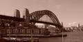
| 01/16/2003 06:27:46 PM |
Sydneys Greatest (Bridge)by RavenComment by timj351: I hate to say this but I really don't like the sepia color on this photo. It just doesn't work for me. It feels old instead of fresh. I think a straight black and white would have been much better and would have kept the timelessness of the scene. The composition is a little off. I would have framed the scene more to the left and down a bit to show the entire boat in the lower left corner. The mast that is sick up from the bottom edge is very distracting as well. This is a very beautiful location but I don't feel that you captured it as well as it could have been. 5 -Tim |
| 01/16/2003 01:47:10 PM |
|
| 01/16/2003 12:40:52 PM |
Sydneys Greatest (Bridge)by RavenComment by Swashbuckler: Nice shot! Technically this is more of an architecture shot, but I've not dinged any of the other city scapes either, so I won't this one. (Who am I to say you could or couldn't get out to the backcountry...no wheels, not able, whatever) Sepia always makes me think of OLD and that bridge looks very old, but the towers behind it don't (mix doesn't feel good). Focus and lighting seem very good. Contrast is well done, too. 7 Swash |
| 01/15/2003 06:43:53 PM |
Sydneys Greatest (Bridge)by RavenComment by Harz_Joerg: The brige is great and the angle you have chosen is also great. The house in the front dsturbes a little, it catches the viewers attention although it shouldn't. Choise of color and technicaly alos good.
However, to make me rate it higher, it should better fit the challenge: it's too close to the bridge, which dominates the picture. Too me landscape pictures have to give the feeling of space, openess and details (like the bridge) have to stand back. But that's just me. |
| 01/15/2003 02:00:43 PM |
|
| 01/15/2003 09:44:43 AM |
|
| 01/15/2003 07:03:15 AM |
Sydneys Greatest (Bridge)by RavenComment by HBunch: I'm not too fond of the pink tint, but the shot looks very nicely done. Focus and clarity are great. The detail is amazing in the bridge. Looks like you did a great job leveling the photo. Placement of the bridge within the photo is nice, and lighting seems good. No hot spots or distracting shadows. That pole intruding from the bottom near the right corner is kind of out of place, but sometimes we take what we can get. Very nice view. Good luck in the challenge. |
| 01/15/2003 04:39:16 AM |
|
Home -
Challenges -
Community -
League -
Photos -
Cameras -
Lenses -
Learn -
Help -
Terms of Use -
Privacy -
Top ^
DPChallenge, and website content and design, Copyright © 2001-2026 Challenging Technologies, LLC.
All digital photo copyrights belong to the photographers and may not be used without permission.
Current Server Time: 07/15/2026 10:51:34 PM EDT.