| Image |
Comment |
| 03/30/2003 11:26:43 PM |
I Hate Showersby nathaliedooComment by karmat: I can appreciate this so much. I wanted to get a good picture of one of my 14 months old's tantrums, but he didn't have a good one while I had my camera ready!!
I really like the crop you used here! |
 Photographer found comment helpful. Photographer found comment helpful. |
| 03/30/2003 10:23:28 PM |
|
| Photographer found comment helpful. |
| 03/30/2003 04:23:16 PM |
|
| Photographer found comment helpful. |
| 03/28/2003 07:47:58 PM |
I Hate Showersby nathaliedooComment by KarenB: good expression of emotion. can't decide if I like the cut in half approach for this or not.. but lighting is good, and I like the even tones. |
| Photographer found comment helpful. |
| 03/27/2003 08:46:13 PM |
|
| Photographer found comment helpful. |
| 03/26/2003 11:29:22 PM |
|
| Photographer found comment helpful. |
| 03/26/2003 10:26:12 PM |
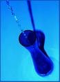
Filling a Flower Vaseby nathaliedooComment by karmat: CRITIQUE CLUB CRITIQUE
by karmat
COMPOSITION
I think the composition of this works well in part because the eye "enters" the frame in the top left and is able to follow the water down into the vase. The shadow behind it also sets up some nice converging lines.
TECHNIQUE
The focus here is great, adn you have captured the falling water nicely. I like the overall blue tone, but in the bottom, around the base of the vase, it looks a little odd to me. The blue looks almost blown out and causes it to seem an unnatural teal or aqua color.
OVERALL EFFECT
This is a very interesting shot, adn the blue (with the water) makes it feel peaceful and relaxing to me. It may have been interesting, though not better to crop the bottom of the vase off, then turn the picture upside down. Also, if the blue hues were not acquired in post-processing, a bright yellow or red flower may have added some color contrast. Again, not necessarily making it better, just making it different. |
| Photographer found comment helpful. |
| 03/26/2003 12:31:31 PM |
|
| 03/26/2003 09:33:09 AM |
|
| Photographer found comment helpful. |
| 03/26/2003 07:42:31 AM |
Spoon Starby nathaliedooComment by inspzil: Greetings from the Critique Club
By Inspzil
Composition - I really like the composition of this photograph and probably why it was one of my highest rated. The framing is very good and the color is nice. The extra reflections in the spoons is a little distracting, but tolerable at worst. Great idea and well executed.
Technical - Very well taken photo. Nice and sharp with great exposure. No obvious processing flaws or compression problems.
Overall - This may be the shortest critique I've ever written. I really liked the photo and scored it well. The only thing I think that could've been better is omitting the reflections from the spoons, especially of the photographer :) I really like this photo. Great job and thanks for sharing it with us. Keep up the good work and Bon Chance! - Inspzil |
| Photographer found comment helpful. |
Home -
Challenges -
Community -
League -
Photos -
Cameras -
Lenses -
Learn -
Help -
Terms of Use -
Privacy -
Top ^
DPChallenge, and website content and design, Copyright © 2001-2026 Challenging Technologies, LLC.
All digital photo copyrights belong to the photographers and may not be used without permission.
Current Server Time: 07/16/2026 11:10:38 PM EDT.