|
|
|
Showing 161 - 170 of ~229 |
| Image |
Comment |
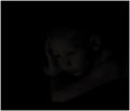
| 06/20/2003 05:05:55 AM | Timeless Youthby dodobirdComment by jmsetzler: your image is gonna get hammered. I can barely see this child and my monitor is calibrated. It\'s so faint that many are gonna see nothing but a black frame. |  Photographer found comment helpful. Photographer found comment helpful. |
| 06/20/2003 04:15:50 AM | | | Photographer found comment helpful. |
| 06/20/2003 04:01:10 AM | Timeless Youthby dodobirdComment by JPR: this might be a tad too dark, which is a shame, since i'm sure it wasn't and you just darkened it for this ridiculous challenge. I've seen the worst shots on here yet. This could be one of the best of them if it was just a little lighter. I believe you can have your highlights at 30% black for lowkey, which is actually pretty light. I'm still scoring this high, but it's a bit of a challenge to look at it in itself! | | Photographer found comment helpful. |
| 06/20/2003 03:01:37 AM | Timeless Youthby dodobirdComment by RiderGal: The thumb looks pitch black, the photo looks fricking awesome! Very cool usage of both low key photography and black on black. excellent job! I'm guessing quite a bit of this was done in photoshop, but it's just very well done. I like your use of negative space on the left side of the photo, makes you wonder what this kid is looking at. Once again... well done, this is the photo that first caught me eye, it's the first one I'm voting on, so it's definitely my first 10 :-) Good lucK! | | Photographer found comment helpful. |
| 06/20/2003 02:01:18 AM | | | Photographer found comment helpful. |
| 02/09/2003 07:30:09 PM | The last pieceby dodobirdComment by Natasha: Critique Club
Composition-Content
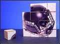
I think that your idea for this was great, a very original take on the square theme. You have perfectly met the challenge. Composition is good here, but I think that if you had tilted the blocks a little, you would have achieved a more 3D effect, which would have added more dimension and interest to the picture. Personally, I like the use of negative space here and leaving a single block out was a good idea. I wonder if that using the hockey picture, you might have alienated a bit of the audience, you had comments from people that love the sport, but for those who don't I wonder if a brighter, more colourful picture might have helped this stand out.
Background
I think that the background is good, I like the different tones and the division of the top and bottom. Perhaps with a brighter picture on the blocks, the colour choice of the background would have had a stronger impact. As it is, I personally like the colour choice.
Technical
Great focusing and colour saturation here. The overall lighting is good, there is one hotspot on the helmet,I am not sure if that happened while taking the picture of the helmet (more likely, cause it is so shiny) or taking the final picture. If the former, then perhaps not using a flash would have helped, or bouncing the flash for softer lighting.
My Opinion
I think that all the effort put into this picture, really paid off. Really original idea and great shot. Perhaps the only thing I would change would be to tilt the cubes a bit for a more 3D effect and perhaps use lighting that cast shadows ( I like shadows!), perhaps to the side of cubes. Good Luck in the next challenge |
| 02/09/2003 11:00:31 AM | |
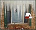
| 02/09/2003 12:00:13 AM | Michigan Stalactitesby dodobirdComment by DougPaz: Greetings from the Critique Club };-)
Initial thoughts
It looks stinking cold!! Meets the challenge, a bit off balance
Composition/ Content
The biggest thing that jumps out at you (after the icicles of course!) is that it seems to be leaning a bit to the left. The window and the stand for the birdhouse are leaning left and it makes the whole shot seem off balance. Other than that, I like the addition of the birdhouse as it adds some needed color. I wonder if you tried this from different angles, perhaps a more straight on shot of the window.
Background
The bricks and shutters seem a bit drab but that is part of winter as I remembrrrrrr it from my time up north.
Camera Work - Technical
Focus seems like it could be just a little sharper. Of course you were probably shivering and I doubt you were using a tripod.
Digital Processing - Technical
It seems that a little more color from the shutters and perhaps a little less from the birdhouse is in order. You may have been able to do that by playing with the saturation and hue in post production if you have Photo Shop available.
Fits The Challenge
Definitely fits the challenge well.
My Opinion On The Photo
I originally scored this shot a five as did almost half of the voters. It is a good solid shot but wasn't a real grabber. Good job, and keep up the good work.
I would be happy to talk further about this shot if you would like to contact me.
DougPaz
|
| 02/02/2003 06:43:54 PM | |
| 02/02/2003 04:50:22 PM | Michigan Stalactitesby dodobirdComment by PTLParsons: Is this in Hell, Michigan? Thought maybe it had frozen. Beautiful ice cycles. But your roof was dirty. These aren't any good for eating, just beautiful to look at. The bird house or feeder is a nice touch. Really like this photo. The cropping, focus, colors, etc. are all well done. This is worth an 8 in my book. |
|
Showing 161 - 170 of ~229 |
Home -
Challenges -
Community -
League -
Photos -
Cameras -
Lenses -
Learn -
Help -
Terms of Use -
Privacy -
Top ^
DPChallenge, and website content and design, Copyright © 2001-2026 Challenging Technologies, LLC.
All digital photo copyrights belong to the photographers and may not be used without permission.
Current Server Time: 07/16/2026 07:58:22 AM EDT.
|