| Image |
Comment |
| 09/05/2006 05:28:55 PM |
|
| 09/05/2006 05:16:57 PM |
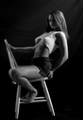
Enchanting Momentsby AkchasComment by NathanWert: I'm not sure if you were trying for a soft focus or not, but I'm not sure it works with how dark this is. However, your model is very atractive.
I do have a couple of observations her panty strap is twisted. You might want to clone out the shadow of the light in the lower left. You also might want to consider getting the background to be just the fabric and not include the wall. The dark item she is kneeling on is also a distraction. Along with the seem by the light shadow. Her shirt is bunched up, that works, but she's got her skin right below it on her side and back bunched up as well, it doesn't look very complimentary.
I don't want to sound too negative, I jsut see a lot of potential with this. |
| 07/16/2006 11:50:00 PM |
|
| 07/16/2006 09:12:15 PM |
|
| 07/16/2006 05:35:26 PM |
|
| 07/16/2006 01:57:35 PM |
|
| 07/16/2006 01:34:26 PM |
Quite Passionby AkchasComment by LucidLotus: Lovely girl. Fun pose. I like the choice of black and white as it highlights the form better than color in my opinion, I wonder how a mostly desaturated image would look though - not quite B&W, with just a hint of color. The composition is good, though I don't like the very tight crop at the bottom and I wish the focus was a little sharper. I think more soft light on the face and the legs would give her just a bit of a glow that would be pleasing and bring more detail of her face out and help combat the strong light on the right. I think its a good choice for her eyes to be closed or at least really lowered but that and her expression gets lost a bit in the shadows. I'm not sure I'd relate it to a 10 as personal tastes vary but its a nice portrait that is clearly going for a sensual/sexy feel. I gave a 6 |
| 07/16/2006 07:40:26 AM |
|
| 07/15/2006 06:46:21 PM |
|
| 07/13/2006 03:13:14 PM |
Quite Passionby AkchasComment by amandalore: awesome photo, not sure I see the 10 (unless you're implying that she is a 10, in which case, that's what the title's for), also you might try adding more negative space to the left and bottom sides of the photo to balance it |
Home -
Challenges -
Community -
League -
Photos -
Cameras -
Lenses -
Learn -
Help -
Terms of Use -
Privacy -
Top ^
DPChallenge, and website content and design, Copyright © 2001-2026 Challenging Technologies, LLC.
All digital photo copyrights belong to the photographers and may not be used without permission.
Current Server Time: 07/16/2026 07:12:37 AM EDT.