| Image |
Comment |
| 05/22/2003 07:39:30 PM |
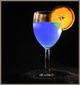
A Good Mixby RuchartComment by qachyk: Blue Curacao, by any chance?
Very nice, and something I haven't seen yet this round. I like choice of light direction as well; it nicely higlights the colours without introducing any real distraction. |
 Photographer found comment helpful. Photographer found comment helpful. |
| 05/22/2003 09:14:54 AM |
A Good Mixby RuchartComment by shadow: i like the way the blue liquid glows, but note the deformity on the leg of the glass. |
| Photographer found comment helpful. |
| 05/21/2003 01:53:11 PM |
A Good Mixby RuchartComment by karmat: Nice set up, but the space on the left is a bit too much, I think. There is not enough of it to be effective negative space, but there is enough to make it feel unbalanced. |
| Photographer found comment helpful. |
| 05/21/2003 09:52:41 AM |
|
| Photographer found comment helpful. |
| 05/20/2003 06:35:01 PM |
|
| Photographer found comment helpful. |
| 05/20/2003 09:20:57 AM |
|
| 05/19/2003 08:17:42 PM |
A Good Mixby RuchartComment by BigSmiles: Very neat. A few suggestions/nitpicks.. the glare on the glass is pretty distracting as is that curly thing (a hair?) on the stem of the glass and the lighter shade on the right side of the image. I would have tried illuminating the base a little bit more to bring out its shape. Overall it's very well done and I like the glowing blue. 7 |
| Photographer found comment helpful. |
| 05/19/2003 07:18:15 PM |
A Good Mixby RuchartComment by Gordon: a hard shot to light well and you've made a good attempt. The specular highlights on the left of the glass don't add much - often glass is better to light from behind and let the light shine towards the camera - perhaps from a bright background with the light shining on it. |
| Photographer found comment helpful. |
| 05/19/2003 05:42:51 PM |
|
| Photographer found comment helpful. |
| 05/19/2003 03:42:30 PM |
A Good Mixby RuchartComment by StevePax: All the black space is distracting. I know you're using the rule of thirds, but perhaps you could adjust the headspace a little, crop the left side, and make the orange appear in the top right third? |
Home -
Challenges -
Community -
League -
Photos -
Cameras -
Lenses -
Learn -
Help -
Terms of Use -
Privacy -
Top ^
DPChallenge, and website content and design, Copyright © 2001-2026 Challenging Technologies, LLC.
All digital photo copyrights belong to the photographers and may not be used without permission.
Current Server Time: 07/16/2026 03:09:42 AM EDT.