A Good Mixby
RuchartComment by HBunch: *Critique Club*
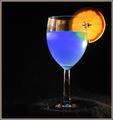
Nice ATTEMPT? I like how everyone assumes you were trying to "copy" something. I know the shot they're thinking of, but I've never really looked closely at it, so I wont be comparing you to him, nor this shot to that shot.
I do want to say that the ONLY thing that really bothers me at all about this shot are the light glare and the reflection of the orange on the left side of the glass. The glare on the right side below the orange does not bother me, and I actually like it.
I guess I do also wonder if a bit more black space would be better to the left. Either that, or center the subject dead on. It's not off center enough in this frame to really create a dramatic use of neg. space.
Otherwise, I love the colors. They stand out very nicely on the background, and are quite strong and vivid.
Your focus and clarity are great. I almost wanted to say that I wish the orange were a bit more clear, however, I like the darkness on it, and I don't think it would be easy at all to achieve both.
I also like how we are not looking straight on at the glass, but at an angle slightly.
Really nice. Love that color blue.
~Heather~