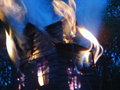
Burning down the Houseby
snafflesComment by hanneke: Hello, Greetings from the Critique Club.
As requested, here is an indepth critique of your submission. Please keep in mind this is a personal opinion.
First Impression - the most important one:
Aaaw.. too bad it isn't in focus... but the colors are amazing!
Composition / PoV:
The composition looks allright, might have cropped a bit off the right. I'm guessing lots of voters thought it was a real house (very clever of you to use a tea-candle burner!). To increase that effect, you might have taken the photo straight and a bit lower (from the ground).
Subject:
This does fit the challenge.
Technical (Color, focus, and light):
Focus: I think you lost a lot of points with the focus.. that's a pity!
Color: The purple & yellow colors are great, but the blue doesn't really fit here IMO.
Light: The light seems to be ok.
Like I said, I think you were voted down because of the focus. But I think with your creativity, after practicing with focus, it will be better.
I hope you've found this critique helpful. Good luck with future challenges!