DPChallenge: A Digital Photography Contest You are not logged in. (log in or register
 
Browse Settings
Currently viewing:
Registered Usersnaffles

Show comments:

Per page:

Order:

Comments:


Comments Received by snaffles
Pages:   ... [540] [541] [542] [543] [544] [545] [546] ... [579]
Showing 5421 - 5430 of ~5790
Image Comment
Flank of a bay mare
12/22/2006 07:09:45 AM
Flank of a bay mare
by snaffles

Comment by Puckzzz:
very abstract!
Photographer found comment helpful.
Pining for the cedar
12/21/2006 06:41:00 PM
Pining for the cedar
by snaffles

Comment by klstover:
The composition appeals to me.
Photographer found comment helpful.
Octopussy!
12/21/2006 01:44:28 PM
Octopussy!
by snaffles

Comment by snaffles:
just checked the scores on Bond to see where Octopussy would've landed up, based on rough score of 5.809 (my calculations). He'd've have finished up about 28th! Argh!
Flank of a bay mare
12/21/2006 07:25:20 AM
Flank of a bay mare
by snaffles

Comment by skylercall:
I like it but it is nothing I would hang up on my wall.
Photographer found comment helpful.
Dirty Twisted Nail
12/20/2006 08:03:33 PM
Dirty Twisted Nail
by snaffles

Comment by Dr.Confuser:
Greetings from the Critique Club! I have been assigned your photo to critique and here are my thoughts:

Personal Reaction: I am sorry to say my initial reaction to this was pretty negative. Although I didn’t vote, if I had I would have given it a 4 â€Â¦ possibly a 3. Partly this was due to a subject I didn’t resonate with and partly due to execution.

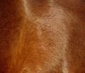
Composition: You have a diagonal composition. Usually this works best when the diagonal divides the photo into 2 regions with different elements above and below the diagonal. In this case, the region above and the region below are essentially the same. So the power of the diagonal comp was lost.

Technicals: I agree with the comments you got about color, post processing and focus. I am not sure what was causing the issues but they detract from the image. Someone mentioned the background looked like fertilizer. To me it looks like broccoli. I think if you try for lighting that reveals true color and post processing that preserves it, you will have better photos. Watch your exposure and try to fill the histogram all the way to both ends.

Overall: Actually, I like what you were trying to do here. If the execution had been stronger, you probably would have won an extra point, maybe a point and a half in the voting.

As always, these are my personal observations. Feel free to PM me if you’d like further dialog about the photo or my critique.

Photographer found comment helpful.
Donkeys in love
12/20/2006 10:48:32 AM
Donkeys in love
by snaffles

Comment by noraneko:
I love that you brought donkeys to what was essentially a "dog and cat" show! They are very cute and obviously great pals. Unfortunately, the photo is a bit dark and not quite in focus. A bit of dodging on the donkeys' faces might help bring them out a bit more?
Photographer found comment helpful.
Donkeys in love
12/20/2006 10:09:04 AM
Donkeys in love
by snaffles

Comment by snaffles:
Thanks everyone for comments during the challenge. I knew of course that a portrait traditionally shows just the face, but shooting equids (ie horses, ponies, donkeys) is tricky as they have such long faces. Also taking into account that these beasties tend to 'talk' with their whole bodies, not just their faces, is why I chose to shoot as I did.
Flank of a bay mare
12/20/2006 01:06:38 AM
Flank of a bay mare
by snaffles

Comment by Photologist:
I don't know what it is. It looks like a great image, but there just doesn't seem to be that one thing to pull it all together. Maybe not enough contrast? A focal point? I don't know...something is just missing.
Photographer found comment helpful.
Pining for the cedar
12/19/2006 03:17:22 PM
Pining for the cedar
by snaffles

Comment by adrian232:
good idea, but the picture seems too simple...
Photographer found comment helpful.
Dirty Twisted Nail
12/18/2006 07:52:42 PM
Dirty Twisted Nail
by snaffles

Comment by JuliBoc:
I gave this a 5 because something about the dirt looks over-processed, perhaps over-sharpened or over-saturated or both. Even the colors of the nail look flat. I like the composition, though, and the simplicity of the nail in the dirt.
Photographer found comment helpful.
Pages:   ... [540] [541] [542] [543] [544] [545] [546] ... [579]
Showing 5421 - 5430 of ~5790


Home - Challenges - Community - League - Photos - Cameras - Lenses - Learn - Help - Terms of Use - Privacy - Top ^
DPChallenge, and website content and design, Copyright © 2001-2025 Challenging Technologies, LLC.
All digital photo copyrights belong to the photographers and may not be used without permission.
Current Server Time: 09/06/2025 10:54:57 AM EDT.