| Image |
Comment |
| 05/24/2007 10:40:48 AM |
hotpastaby snafflesComment by hotpasta: I am flattered...thanks...
as far as the image is concerned, perhaps a little noisy there, but hey, thanks again |
 Photographer found comment helpful. Photographer found comment helpful. |
| 05/23/2007 10:35:17 PM |
|
| Photographer found comment helpful. |
| 05/23/2007 04:48:33 PM |
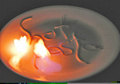
hotpastaby snafflesComment by Dirt_Diver: Image is too blury and out of focus. Neat idea but poor setup. There is a gray line at the bottom of the image and a color blur or whatever that's called on the bottom right. For sure you have had to see that right?
Also the crop is awkard. There is more plate on one side then the other. It just doesn't feel right to me. Good luck with your entry. |
| Photographer found comment helpful. |
| 05/23/2007 02:25:02 PM |
|
| Photographer found comment helpful. |
| 05/23/2007 06:03:07 AM |
hotpastaby snafflesComment by Grandad: i did a shot like that once, with a little squert of lighter fuel, and the plete cracked in two, and the fire went onto the table, used a bit too much i supose, nice idea, crop is a little tight, and is a bit grainy |
| Photographer found comment helpful. |
| 05/23/2007 01:20:12 AM |
hotpastaby snafflesComment by BeeCee: Good idea, but high noise due to the low light. Noiseware is a good free program, or I've found that, in Photoshop CS at least, under "blur" is "surface blur". I use it at low settings, such as about 6 and 6, to clean up noise without losing detail. Hope this helps :) |
| Photographer found comment helpful. |
| 05/22/2007 11:52:05 AM |
|
| Photographer found comment helpful. |
| 05/21/2007 07:01:05 PM |
|
| Photographer found comment helpful. |
| 05/21/2007 02:19:46 AM |
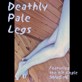
Deathly Pale Legsby snafflesComment by ericwoo: Hey there from the Critique Club
Camera Work/Technical: Crisp focus on the on the woodwork, but the legs seem to lose some sharpness with your depth of field. Nice work with the colors and post-processing to create a nice, pale set of legs.
Lighting: Very nice and even. No blown highlights and no details were lost in the shadows.
Composition/Content: I agree with Kelly on the border, but I do like the overall composition. I like it even more after reading that you were upside down when it was shot. I think that those borders could have been half that size, maybe even less, and the layout would have looked better.
My Opinion: I do like it, but I think that I'd like it more with less border and better focus on the legs.
Thank you for the opportunity to provide a critique on your entry,
Eric
|
| Photographer found comment helpful. |
| 05/20/2007 02:52:33 AM |
Deathly Pale Legsby snafflesComment by klstover: Not a great composition for me - the thick borders do not add much to the overall look (although I do like how you lined up the letters DPL with the border - that is nice). |
| Photographer found comment helpful. |
Home -
Challenges -
Community -
League -
Photos -
Cameras -
Lenses -
Learn -
Help -
Terms of Use -
Privacy -
Top ^
DPChallenge, and website content and design, Copyright © 2001-2026 Challenging Technologies, LLC.
All digital photo copyrights belong to the photographers and may not be used without permission.
Current Server Time: 07/23/2026 12:56:13 AM EDT.