|
|
|
Showing 3621 - 3630 of ~5790 |
| Image |
Comment |
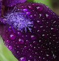
| 06/08/2009 01:28:17 AM | Rainby snafflesComment by ShutterPug: Greetings from the Critique Club
Positives: The extreme close up ensures the viewer will notice the rain drops and not just think "ok, another flower shot". The composition works well. I like the diagonal line my eye follows.
You have captured the beautiful coloration of a deep purple that really catches the eye.
Negatives: The lighter purple flower part in the upper left (stamnin ?) looks as if it was not in very good focus and you tried over sharpening it to correct that flaw. When I see a flower, I think of soft and dainty, not harsh like this.
Looking closely at this image, the drops that I like the most are those that lie tangential to the flower petal. Perhaps shooting at a more tangential angle over all would have created an even more interesting point of view of the raindrops. |  Photographer found comment helpful. Photographer found comment helpful. |
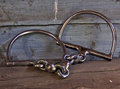
| 06/08/2009 01:24:42 AM | Just a bitby snafflesComment by salmiakki: Greetings from the Critique Club
I'm starting to think that the script that selects the images for critique is set so that all of yours come to me! It's actually starting to be funny now. I have had 3 of your images in the last 24 hours.
I won't give you a very long critique this time around! You probably are tired of reading the same things.
In this image, the subject matter was I guess reasonably unusual, certainly a much better choice than some of the others! Composition is a OK, probably could have been a bit more creative, perhaps taking the shot at the same level as the bits, rather than looking down on them.
The lighting is a bit flat, and that could have been fixed simply in PS. I did a quick levels adjustment and the difference was quite marked. (PM me if you want me to show you). Looks like you may have used the on board flash as there are some shadows. Again, I think if you cranked the ISO to 400 you could have done this without the flash and perhaps got a better overall exposure. Trial and error I suppose with this.
OK, so much for a short critique!
I thought this was quite a good one for the challenge, could have scored better with a slightly different composition and slightly different processing.
| | Photographer found comment helpful. |
| 06/07/2009 12:31:59 PM | | | Photographer found comment helpful. |
| 06/07/2009 10:18:10 AM | Trying to convert a hayloft into a loft apartment...by snafflesComment by salmiakki: Greetings from the Critique Club
This is starting to get weird now! I'm wondering if anybody else is ever going to crop in my queue. I think this is my 6 critique for you in the last few weeks.
I wrote a big long critique and then my machine got stuck and I needed to reboot, so just lost it all.
I am going to start this critique by asking you, a fellow critique club member, how you would critique this image?
I have a couple of questions about it. When you entered this into the I Quit challenge, did you really think it actually met the challenge, or did you think that you could squeeze it in with the title? (I'm assuming you did think it met the challenge or your would not have entered it) Do you yourself like it? What score would you give it in light of the challenge topic?
I ask the questions, just as a pre-amble to my critique, because my words may sound harsh, but I think if you put this up for critique, then you want real feedback and not just platitudes.
Technically this image is lacking. The exposure is off, it lacks contrast and the colours are washed out. Some of these things could have been fixed in camera by using the correct exposure, but a lot could be done in post processing since the highlights and shadows are not clipped. I'd be very interested to see the original file, as you have listed a whole bunch of editing steps, but I am not sure what those have done to this one. It may have been a good idea to boost the ISO to 400, it may have given you a faster shutter speed which in turn may have made the image a bit sharper. Even with VR 1/30 is quite a slow shutter speed and could easily give you a bit of camera shake. Typically anything lower than 1/60 is going to cause some kind of camera shake.
Coming back to the concept. I'm afraid to say I see this as a real shoe horn for this challenge. The image itself does not really portray quitting, it relies on the title to link it to the challenge topic. You were far from the only person to do that. I think this was a really difficult challenge, so kudos for giving it a go.
Susan, I'm sorry if this critique sounds harsh, it's not meant to be and I certainly do not want to discourage you. Having critiqued so many of your images just recently, I would just like to help you a little bit.
Sarah
| | Photographer found comment helpful. |
| 06/07/2009 04:33:13 AM | Lexus Manby snafflesComment by salmiakki: Greetings from the Critique Club
Well, me again!
Sorry this didn't tip the 5 scale. I think conceptually this was an almost there kind of shot. I think anybody who chose not to include text in this challenge was hurting with the score. As it was an advertising challenge, a much more graphic feel was needed to score well.
From a technical point of view, I think you are hurting a bit too. The image is quite over exposed, especially in the sky area. What would have helped you a lot in this specific case would be to use a circular polariser on your lens. So not a photoshop trick this time! The polariser would have helped make the blues bluer and yet keep the clouds fluffy and white.
That said, you could have also fixed it to some extent, very very easily in photoshop. The highlights in the clouds are just a bit too blown out to do much in PS.
Perhaps think about bracketing your shots to get the optimal exposure in the future. The histogram on your camera is your friend. Check it out, if the histogram is strongly to right, you have overexposed the highlights, or if it's strongly to the left, you have underexposed the shadows. In both cases, it's nearly impossible to get any detail back in post processing. If you set the camera to bracketing mode, where it takes one at what the camera thinks is the correct exposure and then the next 2 images will be a 1/3 of a stop (if that's what you have set the bracketing to) under exposed and a 1/3 stop over exposed. That way you get a more accurately exposed shot and less work to do in PS. Doing this can help as sometimes the camera doesn't get it right!
Concerning the composition, I think the angle of view could have been improved. As several people commented, this seems to be more about the man and less about the car. Moving him to the other side, would have been a good idea. Also, you do have a bit too much sky, which again takes away from the car.
As I said, though, the concept was good and some small changes to both the composition and exposure could have brought it up at least to the mid-fives (even without the fancy graphics and texts).
| | Photographer found comment helpful. |
| 06/06/2009 12:11:13 PM | | | Photographer found comment helpful. |
| 06/06/2009 10:20:48 AM | Rainby snafflesComment by hotpasta: it's OK...nice and colourful, but the processing looks strange on the drops...is it the watercolour filter in photoshop? | | Photographer found comment helpful. |
| 06/03/2009 08:13:46 AM | | | Photographer found comment helpful. |
| 06/03/2009 05:19:38 AM | | | Photographer found comment helpful. |
| 06/03/2009 12:40:48 AM | | | Photographer found comment helpful. |
|
Showing 3621 - 3630 of ~5790 |
Home -
Challenges -
Community -
League -
Photos -
Cameras -
Lenses -
Learn -
Help -
Terms of Use -
Privacy -
Top ^
DPChallenge, and website content and design, Copyright © 2001-2026 Challenging Technologies, LLC.
All digital photo copyrights belong to the photographers and may not be used without permission.
Current Server Time: 05/23/2026 11:05:44 AM EDT.
|