| Image |
Comment |
| 06/06/2006 02:52:56 PM |
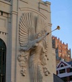
Bass Performance Hallby bgslawComment by HBunch: *Critique Club*
You've got what appears to be some distortion going on here. The buildings on the right lean to the left, and the main building on the left is leaning right. Some distortion correction might help this a bit. It's not major, but distracts some for me.
Focus and clarity are really good. We get to see lots of the detail in the angel.
I'm seeing this as more of a photo of the angel than a photo of the building though. I mean, it is part OF the architecture, but I'd like to see more of that building.
The lighting on the front of the building looks to me to be a bit too dark. The color is muted and I'd like to see just a bit more contrast in the front. I wonder if some extra adjustments to the brightness/contrast might have helped enhance the look of the lighting there.
The door on the left is a bit of a distraction since it is so dark against the rest of the photo which is all lighter colors.
The sky is a nice blue, not blown out or too bright.
Technically, it's a good shot, it's just lacking a little something to make it 'great'.
~Heather~ |
 Photographer found comment helpful. Photographer found comment helpful. |
| 06/04/2006 06:56:04 PM |
A Successful Mardi Gras in Mobile, Alabamaby bgslawComment by kari1: ::: Critique Club :::
Hi, my name is Kari and from the critique club.
First Impression - the most important one:
busy and colourful and full on.
Composition:
This is so busy bit the main focus of the main medal with the two side verticals is extremely centred, which is a little off putting.
Subject:
This is interesting for some this would meet the challenge, and others like me would go ... so what - this actually doesn't mean anything to a lot of people and I don't think that helped in the voting. I have been caught out by this a number of times with people not understanding the significance of a shot.
Technical (Colour and light):
This works well .. I like the lighting and the fantastic range of colours.
To grow its vote?:
Appeal to the populace ... so hard to do ...
Summary:
Great eye and good shooting .. keep it up.
If you've got any questions about this critique, please feel free to contact me via
the PM system.
Cheers
Kari |
| Photographer found comment helpful. |
| 06/02/2006 12:56:57 PM |
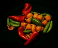
Texas Heatby bgslawComment by jerowe: Hello from the Critique Club, I'm Jon Rowe, and I will be looking at your image today :)
Great challenge to enter something like this in. I LOVE the composition of the peppers in the shape of the Texas. Me being from Arkansas (SOOOEY) i found this quite amuzing, and such a great use of space. great creative flow here.
as stated earlier by others, i think the only thing really wrong w/ this is the lighting. it's a rather "flat" lighting, which doesn't give any contrast whatsoever, leaving it with blown highlights and rather harsh shadows. you can really work with things like this for not very expensive at all. when i first got into lighting, i purchased a set of halogen work lamps at wal-mart for around $30 (came w/ 2) and it came w/ a nifty little stand, with a swivel mount. they were great, i really liked them. just an idea, you can mess around w/ some types of diffusers over them, just be careful w/ the heating, for they get very hot. that will give this the soft lighting this type of shot really needs to make all the darks/mids/highlights really pop.
once again, this is a great image, and very well placed. good score, and leaves room for improvement for the next challenge.
keep on shooting, and good luck on your future challenges :)
-Jon Rowe
|
| Photographer found comment helpful. |
| 06/01/2006 10:30:53 PM |
|
| Photographer found comment helpful. |
| 05/31/2006 10:20:06 PM |
|
| Photographer found comment helpful. |
| 05/31/2006 09:37:22 AM |
Bass Performance Hallby bgslawComment by OdysseyF22: Curious, why'd you cut off her feet? The angel dominates so much of the shot that, IMO, it would have been better to zoom out just enough to include all of her in the shot, and still have the architecture in the background, too. |
| Photographer found comment helpful. |
| 05/29/2006 04:28:42 PM |
|
| Photographer found comment helpful. |
| 05/29/2006 02:19:33 PM |
|
| Photographer found comment helpful. |
| 05/29/2006 11:34:37 AM |
|
| Photographer found comment helpful. |
| 05/29/2006 01:04:32 AM |
Texas Heatby bgslawComment by Melethia: Brenda - I love this idea! Perfect arrangement of the peppers, and those of us in Texas can truly appreciate it! It is a little flat, meaning it needs a bit more light/contrast. It may have been a little underexposed when you took it, but you should be able to "pep" it up a bit in post processing. Try posting in the forums and I'm sure people can help you more than I can in things you can try. It's all a good learning experience here. |
| Photographer found comment helpful. |
Home -
Challenges -
Community -
League -
Photos -
Cameras -
Lenses -
Learn -
Help -
Terms of Use -
Privacy -
Top ^
DPChallenge, and website content and design, Copyright © 2001-2026 Challenging Technologies, LLC.
All digital photo copyrights belong to the photographers and may not be used without permission.
Current Server Time: 07/16/2026 04:32:06 PM EDT.