|
|
Comments Received by andlb
|
Showing 121 - 130 of ~200 |
| Image |
Comment |
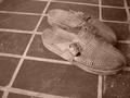
| 02/07/2003 11:38:53 AM | ethnoby andlbComment by myqyl: ~ Critique Club Comment ~
Note ~ If any of this is unclear due to language or cultural differences, please feel free to email me and I'll try to explain more clearly.
Composition : I'm a big fan of strong lines and there are plenty of them here. Shoes are well placed off center and offsetting the lines of the floor.
Exposure / Lighting : The lighting has a flat feeling (that you may have intended) and might have benefited from more direct light. Most successful Black and White shots have a wide range of tones from pure white to pure black and most in between. Most of this is within a very narrow band. This is not necessarily a bad thing, but it didn't work for me.
Focus : Very nicely done. You can almost feel the texture of the floor and the shoes.
Challenge / Wow : Several commenters feel you didn't meet the challenge, and while I disagree with them (I take a loose interpretation of most challenges) you need to realize this is a common problem for images here. Many voters here need the challenge clearly as the main focus of the image. If you are shooting for good scores and possible ribbons, keep this in mind. If you are shooting to make great images that you can be proud of, then keep doing what you are doing :)
My opinion : While I really enjoyed the composition, the lighting left me a little flat. Very nice effort. |  Photographer found comment helpful. Photographer found comment helpful. |
| 02/01/2003 02:39:04 PM | ethnoby andlbComment by PTLParsons: Nice sepia tone even though I do not know what your title means. Good photograph. Nice focus and cropping. Plain and simple but well done. |
| 01/31/2003 04:01:02 PM | |
| 01/30/2003 04:25:19 PM | ethnoby andlbComment by Amiee: I really like the color in this photograph. Good representation of squares. I like the old-fashion like way of this photo. It is very nice. |
| 01/29/2003 11:55:24 PM | ethnoby andlbComment by irae: You've shown a good instinct as far as choosing B/W for this image. The textures and patterns are best presented without the distraction of color. Unfortunately, there are several aspects of good B/W that are missing here. The most important is light. The lighing here is very flat and non-directional. It doesn't make any strong shadows across the image or help to bring out the texture of the shoes. A massive boost in contrast might help a little here, but without good light to begin with there's only so much you can do. The composition, while adhering to the "rule" of thirds, is (IMO) too loose. I know that it was improtant to include the tiles for the square (rectangular?) part of the challenge, but they really don't add anything to the composition. A tighter crop would put the focus on the shoes. Finally, while I'm a fan of found still life, there's something to be said for washing down the front porch occasionallly. The dust and shoe prints are distracting. Hang in there. |
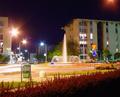
| 01/29/2003 11:11:12 PM | It's rondo!by andlbComment by sylandrix: Greetings from Critique Club...
FIRST iMPRESSION... If I were casually looking through the images in this week's challenge, I may have passed this one. It misses having a strong subject that captures the viewer's attention. Criiquing the image though, I see that there are aspects of the image which are well done.. such as lighting and image quality...
COMPOSITION... I find the composition a little busy, with no strong dominant subject or focus. My eye keeps scanning the image, looking for something to settle on. Perhaps choosing an angle where the road sign or the fountain was more dominant could have helped in this area. The light coming out of nowhere from the top right corner was also a little distracting, and could be cropped out. Actually cropping out most of the sky seems kind of interesting... It lets the viewer focus more on the cityscape and lights. I know it can't be helped, but the foreground looks a little cluttered by the unecessary elements (that green object, and round white bump)
TECHNIQUE... This is an extremely well lighted night scene, and the flare and halos eminating from the light sources are what I find make up the appealing aspects of the image. Very vivid colors. I would expect to see a noisy image given similar conditions.
CONCLUSION... A very well lit scene due to the different colors of lights, with a nice fountain that just screams to have it be the main subject of the photo... or the secondary one of course, since you need a road sign in there naturally :) A pretty good night scene overall, just needs a stronger subject. |
| 01/29/2003 08:17:50 PM | ethnoby andlbComment by KimInNB: I don't see a square here, and the subject certainly isn't square. Don't understand what the title has to do with the photo, either. On the up-side, I do like the composition and ragged look of the shoes. |
| 01/29/2003 05:22:39 PM | |
| 01/29/2003 02:01:13 PM | ethnoby andlbComment by Allen: I like how you have used an older looking display in place of using color or black and white. I think that if you would have had a straight on shot instead it would have created some more intrest into your picture. Nice work |
| 01/29/2003 08:43:35 AM | ethnoby andlbComment by jgillard: I do not get how this fits the square challenge! The colours are nice though. jgillard4 |
|
Showing 121 - 130 of ~200 |
Home -
Challenges -
Community -
League -
Photos -
Cameras -
Lenses -
Learn -
Help -
Terms of Use -
Privacy -
Top ^
DPChallenge, and website content and design, Copyright © 2001-2026 Challenging Technologies, LLC.
All digital photo copyrights belong to the photographers and may not be used without permission.
Current Server Time: 07/15/2026 07:06:45 PM EDT.
|