Here comes the sunby
MilacroftComment by ericwoo: Hey there from the Critique Club
First of all, welcome to DPC. You have found a great community that often seems like a family that is far too close to one another. You will love the site, you will hate the site, and you will most likely become addicted.
Camera Work/Technical: Your chosen settings yielded an image that is nicely focused with a decent tonal range. I'll mention more on that in lighting.
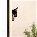
Lighting: Your lighting provides a very nice direction for the eye to flow, but it seems a little flat. You have strong lights and darks, but there is a slight haze over the image. Try to include specific editing steps in your photographer's comments. It helps us out when making suggestions in the critique. I am assuming that you just desaturated the image into grayscale. If you are using Photoshop or elements, try using a Hue/Saturation later, the channel mixer or even LAB color. If you have any questions, feel free to shoot me a PM.
Composition/Content: Your composition is very strong and appealing in this image. The curved wall, as well as the separation of ground surfaces provide great leading lines.
My Opinion: I think that you met the challenge well, and could have scored even better with some slight adjustments. Voters on this site tend to like vivid colors, crisp focus, and third world models. Of course there are exceptions to the general rule, but look through past challenges and I think you'll see what I am speaking of. Again, welcome to DPC. I hope you decide to foot the $25 and join us as a Member.
Eric