| Image |
Comment |
| 04/30/2007 01:19:28 AM |
|
 Photographer found comment helpful. Photographer found comment helpful. |
| 04/30/2007 12:34:12 AM |
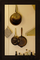
K.I.S.S.by raishComment by krnodil: These are pans that see a lot of use! Nice shapes in the composition, but admittedly not a big fan of the thick border. |
| Photographer found comment helpful. |
| 04/29/2007 11:20:19 PM |
|
| Photographer found comment helpful. |
| 04/29/2007 05:41:50 PM |
|
| Photographer found comment helpful. |
| 04/27/2007 10:37:38 PM |
Q.E.D.by raishComment by cogerox: This would be greatly improved by cropping out the light fixture at the top. Also, the horizontal lines extending through the border doesn't add to the image. |
| Photographer found comment helpful. |
| 04/27/2007 05:38:09 PM |
|
| Photographer found comment helpful. |
| 04/26/2007 07:38:08 PM |
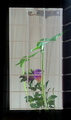
K.I.S.S.by raishComment by Ann: Nice and sharp. The composition is kinda interesting, but I'm not sure what you're trying to convey. |
| Photographer found comment helpful. |
| 04/25/2007 11:38:18 PM |
K.I.S.S.by raishComment by posthumous: inspired composition. at least somebody understands that shapes are supposed to extend out of frame. 9 |
| Photographer found comment helpful. |
| 04/25/2007 09:12:41 PM |
1936 Berlin Motor Showby raishComment by jaysonmc: I really like this picture. It isn't as static as most macro shots, it just feels real. Myabe it has to do with the dust (or whatever it is). I think the lighting and color treatment are superb and the symmetry is excellent. |
| Photographer found comment helpful. |
| 04/25/2007 06:44:17 PM |
Moonby raishComment by purpleflutterby13: Shame you didn't get more detail. Looks sort of oversharpened and pixelated. But is at the same time better than any moon picture I've ever managed to get.
I'm not too keen on the centered composition, I'd prefer it if it was cropped more tightly and the moon was more in the lower right corner. Particularly since there's the cute little star in the top left corner - it'd be nice to see the star in one corner and the moon in the opposite one. |
| Photographer found comment helpful. |
Home -
Challenges -
Community -
League -
Photos -
Cameras -
Lenses -
Learn -
Help -
Terms of Use -
Privacy -
Top ^
DPChallenge, and website content and design, Copyright © 2001-2026 Challenging Technologies, LLC.
All digital photo copyrights belong to the photographers and may not be used without permission.
Current Server Time: 06/21/2026 10:11:08 AM EDT.