| Author | Thread |
|
|
05/12/2007 10:30:17 AM |
|
I would never have thought laundry basket you did good. |
|
 Photographer found comment helpful. Photographer found comment helpful. |
|
|
05/04/2007 11:36:49 AM |
|
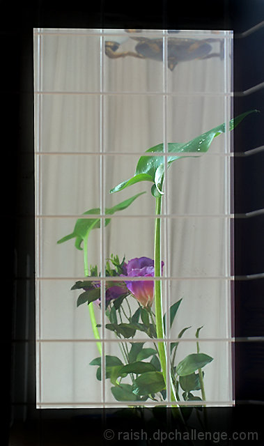
I had to look at this one for a while - it does look like a window pane. Nice sly wink at all those voters with their rulers out, QED indeed! :) |
|
| Photographer found comment helpful. |
|
|
05/03/2007 10:14:50 AM |
|
To me the border and grid gives the impression of looking into a window (frame and panes). And so sneaky showing where the thirds are. |
|
| Photographer found comment helpful. |
|
|
05/02/2007 06:33:15 AM |
|
Very nice of you to provide the graphical divisions to aid the voters. :-) Good challenge entry, but I much prefer the one you didn't enter (though I understand it was beyond basic.) |
|
| Photographer found comment helpful. |
Comments Made During the Challenge  |
|
|
04/30/2007 03:58:56 AM |
|
| Photographer found comment helpful. |
|
|
04/29/2007 11:20:19 PM |
|
the border's a bit too much, no? |
|
| Photographer found comment helpful. |
|
|
04/27/2007 10:37:38 PM |
|
This would be greatly improved by cropping out the light fixture at the top. Also, the horizontal lines extending through the border doesn't add to the image. |
|
| Photographer found comment helpful. |
|
|
04/25/2007 10:19:34 AM |
|
Nice photo, but I think your border actually takes away from the photo in a couple of ways. It looks like you are trying to use the border to make it fit the thirds challenge (which may not be the case, but that is what it looks like). And also your overlaps into the border and can still be seen. |
|
| Photographer found comment helpful. |
Home -
Challenges -
Community -
League -
Photos -
Cameras -
Lenses -
Learn -
Help -
Terms of Use -
Privacy -
Top ^
DPChallenge, and website content and design, Copyright © 2001-2026 Challenging Technologies, LLC.
All digital photo copyrights belong to the photographers and may not be used without permission.
Current Server Time: 06/28/2026 10:14:55 PM EDT.