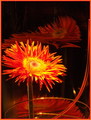
Firey Flowerby
dabidejpnComment by L1: Greetings from the Critique Club!:
Wow...that's a lot of color in this shot! Great start...but there are some areas in which I think this image could be improved, giving you an even better score than 5.6082.
I'm not one who usually even gets the slightest bit bothered with borders, but this time...well, I think it is a bit much. With so much color in the subject, and especially with the curved line of the glass on the right side already in place, the border just really serves to distract and cut up the visual flow instead of simply adding a frame. I'd lose it for sure.
Your composition is very crowded...I'm sure you wanted to get in close and get the details of the flower, but this particular composition really amputates the flow of the image. If we could see more of the glass, it might help. Voters usually take about 3 seconds to study an image, then vote, and then move on. It took me about 5 seconds to really comprehend that the curved line was the glass and not something else in the frame, perhaps a stem from the flower. You lose votes by not getting the voters' time to study things like this. The reflections of the flower seem more as distractions as well, because of the cramped composition.
The colors are intense, but I think they are a bit TOO saturated. The yellows and reds on the flower itself seem muddy and there is a loss of detail, especially in the center. The light is quite harsh on them, which makes the contrast even more harsh. A softer light source or diffusion would go a long way, as well as scaling back the saturation a tiny bit...just a few points maybe.
Your score was very good, so voters liked the concept a lot...the actual image could be even stronger with a bit more planning and time I am sure. Keep clicking, and let me know if you have any questions.
Take care,
Laurie