| Image |
Comment |
| 05/07/2007 04:06:34 PM |
|
 Photographer found comment helpful. Photographer found comment helpful. |
| 05/07/2007 12:30:07 PM |
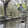
Day at the Parkby meyersComment by colorcarnival: i can understand why you might have desaturated the background - it certainly helps your insets stand apart from the main page. I think this is a lovely family photo. Great idea - I think this is something I am going to have to try. |
| Photographer found comment helpful. |
| 05/07/2007 11:20:22 AM |
Day at the Parkby meyersComment by idnic: Greetings from the critique club!
Hi there. This is a lovely mother/son study which I'm sure this family will treasure. As for DPC, I think the image is lacking a dynamic punch which would have helped it to score better. The soft desat on the main picture is nice, but then looks pale and lacking contrast when compared to the other two. Perhaps b/w on the larger image would have made that difference seem more intentional and would give your image a little more drama.
Hope that helps. Good luck with your future entries.
Cindi |
| Photographer found comment helpful. |
| 05/07/2007 09:31:57 AM |
Day at the Parkby meyersComment by Melethia: I like the use of the large canvas with the smaller inserts, though I think you could have given just a bit more space (not a lot more) to the inserts - let us see the people just a bit more. Looks like a great day, too, by the way. |
| Photographer found comment helpful. |
| 05/06/2007 03:55:28 AM |
Day at the Parkby meyersComment by levyj413: I really like the framing overall and I like how the background image is desaturated. As an experiment, try it with the insets zoomed in much more, so it's like looking through a magnifying glass. Use the large background pic to set the scene, and the insets to give us a more intimate look at them. Also, try two different shots showing them exploring, as opposed to a second shot of them sitting.
Basically, have fun with the format and introduce some variety. :) |
| Photographer found comment helpful. |
| 05/04/2007 11:57:12 AM |
|
| Photographer found comment helpful. |
| 05/04/2007 10:59:34 AM |
He is the Chosen Oneby meyersComment by surfdabbler: A bit more saturation and some sharpening would really bring this image up. It would also help if he was looking intently at the camera, radiating power and a stronger connection with the viewer. I like the toussled hair! |
| Photographer found comment helpful. |
| 05/04/2007 03:29:59 AM |
|
| Photographer found comment helpful. |
| 05/04/2007 12:32:46 AM |
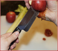
Why I'm Not Allowed in the Kitchenby meyersComment by ursula: Greetings from the Critique Club
I remember seeing this during the voting, and thinking, "Ewwwwwyyy!" I can so sympathize, I cut myself in the kitchen all the time, I'm really clumsy with knives.
Technicals:
Exposure/light looks right, your use of F4.5 gives enough clarity in the main subject while giving a soft blur to the context. The image is processed nicely, although I think I personally would prefer it without the red outer border (it looks a bit like overkill to me). Your main "technical" problem is that the blood doesn't look real, so you had trouble really selling the image. The back hand (the hand with the fake cut) looks a tad out of focus, and could be a bit sharper IMO.
From an artistic point of view, again, your choice of relatively shallow DOF works well with this composition. The composition itself is beautiful, there's enough context to give the image depth without clutter. The yellow/orange shadow is something I wonder about, I wonder if toning it down to a bit greyer would work. The apple being cut, it looks like two pieces in the hand, and the back piece looks like it is a bit too far back for it being cut realistically.
I am surprised at the score on this image - I would have thought it would score a fair bit higher than 4.5. I'm not sure what to tell you about that, except that it's hard to sell stuff to the DPC voters :) I think that the somewhat unreal feel of the photo hurt it quite a bit.
One little detail I love is the oof light spots on the blood in the sink. They make the blood look shiny wet, and that's a quirky little detail that I love.
I hope this helps.
~Ursula |
| Photographer found comment helpful. |
| 05/03/2007 11:07:50 PM |
|
| Photographer found comment helpful. |
Home -
Challenges -
Community -
League -
Photos -
Cameras -
Lenses -
Learn -
Help -
Terms of Use -
Privacy -
Top ^
DPChallenge, and website content and design, Copyright © 2001-2026 Challenging Technologies, LLC.
All digital photo copyrights belong to the photographers and may not be used without permission.
Current Server Time: 05/08/2026 11:05:20 AM EDT.