| Image |
Comment |
| 10/09/2006 12:40:41 AM |
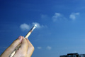
Freedom is painting in the skyby Rino63Comment by ambaker: Critique Club Review:
Focus and depth of field are good.
Color/saturation/hue: The sky looks fine, the hand is a bit pale and the skin tones do not seem quite right.
Lighting appears to come from a different direction than does the rest of the photograph.
I would like to see more of the hand and brush, and the house in the lower right serves only to distract. Or, alternatively you could have sacrificed a brush, put paint on it and let it dry in a bent position as if it really were applying paint to the sky; and then shot with a closer focus on the brush.
Nice concept, it has the bones of a very good surreal photo. |
 Photographer found comment helpful. Photographer found comment helpful. |
| 10/08/2006 03:34:17 AM |
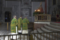
Worshipby Rino63Comment by ambaker: Critique Club Review:
I think you have already gotten a lot of good advice for this picture. The cropping suggestions by amieehtetoo were excellent. The main portion of the picture seems to be in shadow. The highlights on the priest on the left's robe and the floor behind him, tend to draw the eye away from the the rest of the picture. I might have cloned out the man against the wall, between the first and second priest. He is a bit distracting, and does not add to the photo.
I realize, that in this setting you were really limited by what you could do. However I'm left wondering if you would have been able to catch a front view of the priests as they turned to leave.
People tend to like to see faces. Photos from the back, tend to send a messsage of exclusion.
I would also suggest a bit shallower depth of field. If the railing in the foreground were softer, I think I would like this picture a bit better. |
| Photographer found comment helpful. |
| 10/07/2006 09:06:24 PM |
Worshipby Rino63Comment by aimeethetoo: Nice composition and coloring here and it's nice to see different subject matter (even though I went with the boring "usual" myself! :) A couple of nits - I might have cropped a little off the left and the right (Crop Right to get rid of the distracting gold chair and Crop Left nearly up to the left edge of the doorway) and I might have desaturated the blue shirt on the guy standing in the hallway on the left - also a littl distracting. Overall nicely done. A glimpse into the life of the three individuals in green. 7 |
| Photographer found comment helpful. |
| 10/06/2006 08:16:04 PM |
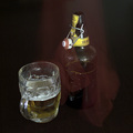
La sciarpa rossaby Rino63Comment by neophyte: Nice comp and idea. This would work well with added text and for the purpose of brand reinforcement. The label should be more prominent. The added effect isn't exactly clear. |
| Photographer found comment helpful. |
| 10/06/2006 06:42:19 PM |
|
| Photographer found comment helpful. |
| 10/06/2006 10:39:01 AM |
|
| Photographer found comment helpful. |
| 10/06/2006 05:26:01 AM |
La sciarpa rossaby Rino63Comment by riccardino: I'm afraid I do not really like the "sciarpa rossa" effect. It could be an interesting and well executed shot without it. |
| Photographer found comment helpful. |
| 10/05/2006 08:06:59 PM |
|
| Photographer found comment helpful. |
| 10/05/2006 07:40:05 PM |
|
| Photographer found comment helpful. |
| 10/05/2006 09:21:15 AM |
La sciarpa rossaby Rino63Comment by Spork99: I really can't tell what's going on. It looks like a some kind of red cloth was over the bottle, then move partway through the exposure. What that has to do with the beer, is not evident. The label is not showing, what beer is this an ad for? I can't read the product name, a big advertising no-no. The glass looks dirty and the head on the beer itself is flat. |
| Photographer found comment helpful. |
Home -
Challenges -
Community -
League -
Photos -
Cameras -
Lenses -
Learn -
Help -
Terms of Use -
Privacy -
Top ^
DPChallenge, and website content and design, Copyright © 2001-2026 Challenging Technologies, LLC.
All digital photo copyrights belong to the photographers and may not be used without permission.
Current Server Time: 06/22/2026 09:28:47 AM EDT.