| Image |
Comment |
| 07/15/2006 05:33:44 PM |
|
 Photographer found comment helpful. Photographer found comment helpful. |
| 07/15/2006 01:21:39 PM |
|
| Photographer found comment helpful. |
| 07/13/2006 09:38:40 PM |
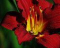
Spider in the Flowerby TonyTComment by Brad: I've seen Day Lilies, and I've seen Day Lilies and even have Day Lilies,
but I've never seen one with a happy face poking out of it - that's great! |
| Photographer found comment helpful. |
| 07/13/2006 09:28:11 PM |
Spider in the Flowerby TonyTComment by suemack: Wonderful rich colours! it's gorgeous. Agree with greatandsmall......she does look she's guarding the gate!! :)) |
| Photographer found comment helpful. |
| 07/13/2006 09:16:43 PM |
Spider in the Flowerby TonyTComment by rox_rox: Brilliant colors! I have to say my favorite part is the spider. It's as though she's guarding the gate. Awesome shot! |
| Photographer found comment helpful. |
| 07/13/2006 07:21:42 AM |
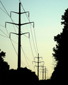
Powerby TonyTComment by atupdate: The silhouette is well exectuted and lines of the power cables help keep the viewers eyes in the photo. The sky however, lacks any features which add to the image and you might want to consider cropping out the tree on the right so it doesn't compete with the main subject. |
| Photographer found comment helpful. |
| 07/12/2006 02:13:57 PM |
Powerby TonyTComment by TheStick: Image seems a little grainy and colors a little washed out. Converting to a grey scale might help. |
| Photographer found comment helpful. |
| 07/12/2006 01:44:00 PM |
Powerby TonyTComment by Lena: This is nice, but it is a bit too grainy. I like the gentle colours of the sky - works better than b&w would have done. |
| Photographer found comment helpful. |
| 07/12/2006 12:41:56 AM |
Powerby TonyTComment by shaver: Interesting - I like the idea but something about this bothers me. |
| Photographer found comment helpful. |
| 07/11/2006 01:56:01 AM |
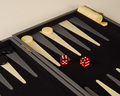
Come on! Six and a four! Six and a four!by TonyTComment by LucidLotus: Nice contrasting colors and simple composition. I wish the lighting were a little brighter. The tones - though the red does stand out - seem very muted and sort of drab. I wish it was a nice sharp black/white to help make that red pop out even more. Focus is decent but seems sharpest on the board where the black token thingies are rather than on the dice where I'd expect it. There is also a slight yellow haze to the image in the main portion of the image which might be due to lighting issues. Still I like the image, I think its fun and it works well for the challenge. 5. |
| Photographer found comment helpful. |
Home -
Challenges -
Community -
League -
Photos -
Cameras -
Lenses -
Learn -
Help -
Terms of Use -
Privacy -
Top ^
DPChallenge, and website content and design, Copyright © 2001-2026 Challenging Technologies, LLC.
All digital photo copyrights belong to the photographers and may not be used without permission.
Current Server Time: 06/21/2026 02:12:25 AM EDT.