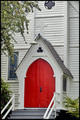
and to him who knocks, the door will be opened. Luke 11:10by
landcameraComment by Artifacts: Positives:
Captures the feeling of a small country church in a pastoral setting.
Technicals:
General composition is OK, especially placement of the vegetation. The red door acts well as a central focal point for the composition theme.
The image is rotated slightly clockwise from the horizontal. Color is weak in the stained glass window and the greens in the trees and bushes. The church walls are fairly bland.
The Challenge:
Review the other entries in the composition and you will see there are some extraordinarily nice church images that got very ordinary scores. In general, if the composition featured only the building it scored lower than if it had other aditional elements supporting the idea of religion.
Yours scored a little above average in a challenge with nice imagery overall. Perhaps voters thought it a bit ordinary and lacked the illusive "wow" factor we all like to find in an image and then become jaded to those that don't have it for us.
The 4 1's stick out. This is pure speculation but perhaps some voters were turned off by your use of Christian Scripture in your title. There is nothing wrong with that and it supports your message well but DPC is a global group and there are places in the world where Christianity is part of the problem in polarized societies, so you get a couple extra 1s.
Suggestions:
For increased "wow" factor, if you go for such things, you might consider adjusting the greens to make them stand out more, applying a heavy dose of dodge and burn to the church wall to give it more depth and texture. Add very, very strong lighting to illuminate the stained glass window from the inside to brilliantly show it's colors and also support the door's invitation to enter.
Though it seems like a small thing rotate the image slightly counterclockwise for "straightening" the horizon. The horizon in a photograph does not necessarily have to match the true horizon. Unconciously viewers expect to see lines that are close to horizontal and vertical to be made "straight". When "crooked" they act as a viewer distraction.
Cropping off the top of the image to just above the white cross over the door would make the image more compact and draw more attention to the door.
Rather that use Scripture to convey your intent in the title, you might consider opening one of the doors to do the same thing photographically. Adding a model standing outside but looking through the door would add more interest to the composition and also support your theme.
Message edited by author 2007-06-10 11:09:22.