| Image |
Comment |
| 05/05/2007 05:54:54 PM |
|
 Photographer found comment helpful. Photographer found comment helpful. |
| 05/05/2007 05:50:23 PM |
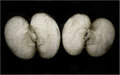
Broken-apart.jpgby UrfaKComment by roz: absolutely love this shot ... so graphic and arty ... (i hesitate to say wot this brought to mind when i opened it ... risque covers it!! ..).. i love your composition .. really like your imaginative approach, and your processing works so well ... |
| Photographer found comment helpful. |
| 05/05/2007 04:53:09 PM |
Broken-apart.jpgby UrfaKComment by violinist123: Love it. Absolutely love images that let me think about them and make up my own interpretations of the subject. First thing I thought when I saw this was 'embryos' for some reason. Great processing. |
| Photographer found comment helpful. |
| 05/05/2007 02:24:01 PM |
|
| Photographer found comment helpful. |
| 05/05/2007 02:22:18 PM |
|
| Photographer found comment helpful. |
| 05/05/2007 01:31:18 PM |
|
| Photographer found comment helpful. |
| 05/05/2007 01:18:51 PM |
Broken-apart.jpgby UrfaKComment by undieyatch: Image defined crop, equalized & proportioned to the subject. Tone is fascinating and interesting, as well as the texture - especially the grain. |
| Photographer found comment helpful. |
| 05/05/2007 01:11:02 PM |
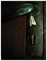
Moth.jpgby UrfaKComment by gsal: Interesting composition. I keep coming back to watch. Excellent rich colors and great texture. |
| Photographer found comment helpful. |
| 05/05/2007 11:02:16 AM |
Moth.jpgby UrfaKComment by SandyP: And I LOVE the beautiful, grungy processing! The textures and rich colors are WONDERFUL!
I just realized that you are 19!!! Wow! You have a TON of talent bundled up in a mere 19 years! :)
|
| Photographer found comment helpful. |
| 05/05/2007 10:37:51 AM |
|
| Photographer found comment helpful. |
Home -
Challenges -
Community -
League -
Photos -
Cameras -
Lenses -
Learn -
Help -
Terms of Use -
Privacy -
Top ^
DPChallenge, and website content and design, Copyright © 2001-2026 Challenging Technologies, LLC.
All digital photo copyrights belong to the photographers and may not be used without permission.
Current Server Time: 07/17/2026 07:54:53 PM EDT.