| Image |
Comment |
| 03/12/2008 07:16:04 AM |
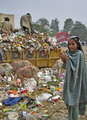
Living with itby UrfaKComment by Stagolee: This is a great image for the challenge and the people in it add another dimension especially when you see them sharing the booty with the livestock. The goats look content at least some good comes from the rubbish. |
 Photographer found comment helpful. Photographer found comment helpful. |
| 03/12/2008 03:00:53 AM |
|
| Photographer found comment helpful. |
| 03/12/2008 01:45:27 AM |
Living with itby UrfaKComment by AP: oh my god that is sad...
Photographically speaking, i would love to see how this photo looked in high contrast B/W! great capture, gl... 8 |
| Photographer found comment helpful. |
| 02/19/2008 11:19:54 PM |
Tandoori Naanby UrfaKComment by In-der-Welt-sein: This is a really good storytelling shot, aided by a nice use of contrast, black and white, and large depth of field. I think everything is about right for what you seem to have tried to do here, including the cropping and the composition of elements in a sort of curvilinear organization. Makes me hungry for some chicken tandoori and some authentic naan bread (which, by the way, I've been craving for the last couple of weeks). |
| Photographer found comment helpful. |
| 02/18/2008 09:55:17 PM |
|
| Photographer found comment helpful. |
| 02/18/2008 05:24:12 PM |
|
| Photographer found comment helpful. |
| 02/17/2008 03:56:59 PM |
Accidentalby UrfaKComment by Dufus: ... litle to much happening in the lover part but still calm feeling in the collors... |
| Photographer found comment helpful. |
| 02/17/2008 02:38:19 PM |
|
| Photographer found comment helpful. |
| 02/16/2008 06:42:17 PM |
|
| Photographer found comment helpful. |
| 02/15/2008 11:08:49 PM |
|
| Photographer found comment helpful. |
Home -
Challenges -
Community -
League -
Photos -
Cameras -
Lenses -
Learn -
Help -
Terms of Use -
Privacy -
Top ^
DPChallenge, and website content and design, Copyright © 2001-2026 Challenging Technologies, LLC.
All digital photo copyrights belong to the photographers and may not be used without permission.
Current Server Time: 07/23/2026 08:44:37 AM EDT.