| Image |
Comment |
| 11/16/2007 06:06:18 AM |
|
 Photographer found comment helpful. Photographer found comment helpful. |
| 11/16/2007 02:31:50 AM |
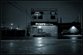
Pumpsby visionistComment by srdanz: A tighter crop would have been better, although this conveys "with no people" even better. It is only hard to see the 'erotic dancing' so quick voters may not get it... |
| Photographer found comment helpful. |
| 11/15/2007 06:55:30 PM |
|
| Photographer found comment helpful. |
| 11/14/2007 06:21:40 PM |
|
| Photographer found comment helpful. |
| 11/14/2007 05:55:09 PM |
Pumpsby visionistComment by SoulMan1978: lol I didn't get it at first, till I read the rest of the sign. It's not very clear at that resolution.
Having said that, it's a nice spin on the challenge, nicley composed, with a great moody atmosphere. |
| Photographer found comment helpful. |
| 11/14/2007 05:32:33 PM |
|
| Photographer found comment helpful. |
| 11/14/2007 10:48:16 AM |
Pumpsby visionistComment by AVP: nice urban capture, could be used as a stock image. bit of a stretch with the theme but 7 nonetheless |
| Photographer found comment helpful. |
| 11/14/2007 07:04:13 AM |
Pumpsby visionistComment by taterbug: Ah, genius! Took me a second, but what a refreshingly creative, original take on the challenge. I do like the shot, but I'm feeling like the composition seems a little uncomfortable. The space at the left of the frame doesn't seem to really contribute anything to the image, I'm wondering if a little tighter framing, losing some of that area could make the photo stronger? The little building with the light and grafitti at right fits in fine I think. Cutting out the left area would also put the main subject out of the center, which, although I think it does work here centered, might work even better offset. Ok, I held some paper up, cropping on the left right up to about the telephone pole, and the bottom up a little to before the white line, and I would definitily say it looks stronger to me :-) But, like I said, great idea, I like it very much, oh, and that towncar in front really makes the shot complete! |
| Photographer found comment helpful. |
| 11/14/2007 05:14:54 AM |
Pumpsby visionistComment by Camabs: Great take on the theme. Nice monochrome conversion. A bit central, but that's not realy disturbing. Like it (7) |
| Photographer found comment helpful. |
| 11/14/2007 02:29:45 AM |
|
| Photographer found comment helpful. |
Home -
Challenges -
Community -
League -
Photos -
Cameras -
Lenses -
Learn -
Help -
Terms of Use -
Privacy -
Top ^
DPChallenge, and website content and design, Copyright © 2001-2026 Challenging Technologies, LLC.
All digital photo copyrights belong to the photographers and may not be used without permission.
Current Server Time: 07/15/2026 12:21:03 PM EDT.