| Image |
Comment |
| 08/28/2006 05:02:27 PM |
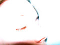
white sleepby klstoverComment by SJCarter: I think I'd like this better if the shadow at the bottom of the shot was less visible. Then I think the high key would work a little better. The colors and composition otherwise are not bad. |
 Photographer found comment helpful. Photographer found comment helpful. |
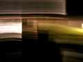
| 07/08/2006 05:40:30 PM |
|
| Photographer found comment helpful. |
| 07/08/2006 04:56:50 PM |
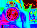
Eightopticby klstoverComment by JunieMoon: Pretty neat. I have done this myself and haven't been able to find a subject I really like using the gradient map. Looks very sci fi. |
| Photographer found comment helpful. |
| 06/28/2006 10:22:37 AM |
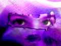
xby klstoverComment by SJCarter: Very unusual and oddly appealing image. I like the eerie quality you've established with this mixed-match combination. Definitely a thought-provoking shot. |
| Photographer found comment helpful. |
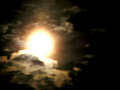
| 06/28/2006 09:44:48 AM |
Supernovaby klstoverComment by SJCarter: Your focus is a bit soft, but I like the composition. I assume that this is the moon? If so, I've found that a slightly shorter exposure length gives me better, clearer results. It took me forever to be able to get a decent night shot, so I'd say you're doing fine! :-) |
| Photographer found comment helpful. |
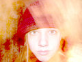
| 06/25/2006 04:29:53 PM |
My Fall Hatby klstoverComment by rscorp: Fiery shot with the red and yellow. You look good in self portraits, keep them coming. |
| Photographer found comment helpful. |
| 06/25/2006 04:29:00 PM |
Turn 12/30by klstoverComment by rscorp: I like this concept. Yeah the white's a bit distracting but the originality of the shot is pretty cool. Interesting. |
| Photographer found comment helpful. |
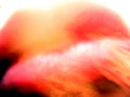
| 06/23/2006 01:46:42 PM |
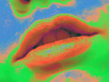
Lips and Lightby klstoverComment by Givemeashot: I would try to re take this one i see Potential in this one. I would try and make the lips a little more clear. so you can see the shape a little more. Love the idea you have some good ones keep it up.... |
| Photographer found comment helpful. |
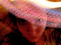
| 06/23/2006 01:44:10 PM |
My Fall Hatby klstoverComment by Givemeashot: I like this one... it looks cool. i like the over contrast feel.... i would take dont the tones just a tad.... but i do like this one alot cool idea |
| Photographer found comment helpful. |
| 06/21/2006 03:43:59 PM |
Our Stripesby klstoverComment by Rikki: An abstract image that almost demands a second look. I would play with this more in PS. Adjust colors and levels and curves and see where you end up with. You might be surprised to see what lies beneath. |
| Photographer found comment helpful. |
Home -
Challenges -
Community -
League -
Photos -
Cameras -
Lenses -
Learn -
Help -
Terms of Use -
Privacy -
Top ^
DPChallenge, and website content and design, Copyright © 2001-2026 Challenging Technologies, LLC.
All digital photo copyrights belong to the photographers and may not be used without permission.
Current Server Time: 07/15/2026 12:48:37 PM EDT.