| Image |
Comment |
| 07/10/2006 02:45:55 AM |
|
 Photographer found comment helpful. Photographer found comment helpful. |
| 07/10/2006 12:37:10 AM |
|
| Photographer found comment helpful. |
| 07/09/2006 11:50:13 PM |
|
| Photographer found comment helpful. |
| 07/09/2006 11:47:17 PM |
|
| Photographer found comment helpful. |
| 07/09/2006 10:06:57 PM |
|
| Photographer found comment helpful. |
| 07/09/2006 07:32:27 PM |
|
| Photographer found comment helpful. |
| 07/09/2006 05:59:03 PM |
|
| Photographer found comment helpful. |
| 07/09/2006 04:57:03 PM |
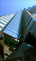
Glass Towersby timfythetooComment by kirsty_mcn: I like the clean simple composition, and the added interest of the triangle of reflections, which seems to combine the city life with the clinical, ordered, cold architecture. I'm not sure why, but I would like a clockwise rotation about 5deg, it just seems a little wonky as is.
I think I'd like it if there was a little more contrast between the colour of the sky, and the colours on the buildings - not sure if this would be possible, maybe with some curves adjustments or something.. |
| Photographer found comment helpful. |
| 07/09/2006 04:30:19 PM |
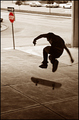
No Skateboarding Allowedby timfythetooComment by kirsty_mcn: I love the toning with the red sign, not too saturated...subtle reference to the "no skateboarding".
I know this wouldn't really be possible with the panning, but I wish the sign was sharper so the "one way" was more obvious.
The exposure seems spot on, and along with the toning gives it a very photojournalistic feel.
I think overall the photo "deserved" better, but I'm not really surprised of its score given the DPC audience |
| Photographer found comment helpful. |
| 07/09/2006 04:16:01 PM |
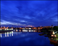
Sixty one secondsby timfythetooComment by kirsty_mcn: At first I saw this and was like "woah....awesome" but after a few seconds it lost some of the wow factor - the background houses seem pretty soft, and lights a tad washed out (so you lose the nice starbursts a bit). THe exposure seems perfect on the santa maria and the right hand side, but not so great in the b/g.
The colours, however, are lovely and rich, but I think there needs to be more of a focal point to the composition. The sky seems to lead you down to the middle of the buildings, but theres nothing there to see. |
| Photographer found comment helpful. |
Home -
Challenges -
Community -
League -
Photos -
Cameras -
Lenses -
Learn -
Help -
Terms of Use -
Privacy -
Top ^
DPChallenge, and website content and design, Copyright © 2001-2026 Challenging Technologies, LLC.
All digital photo copyrights belong to the photographers and may not be used without permission.
Current Server Time: 07/24/2026 10:29:12 PM EDT.