| Image |
Comment |
| 07/14/2006 08:00:55 PM |
Russian Rebelby timfythetooComment by LucidLotus: Cute. I like the concept and the composition is good. Lighting looks nice to me (though the reflection off of some of the dolls is a lttle distracting - no idea how to minimize it without jeopardizing the good stuff though). Great focus, I like the clarity and crispness. I think its hilarious how the rebel doll is there smoking with sunglasses yet still holding her hanky. I think the border works well and of course the image fits the challenge without trouble. I gave a 7. |
 Photographer found comment helpful. Photographer found comment helpful. |
| 07/14/2006 07:16:55 PM |
|
| Photographer found comment helpful. |
| 07/14/2006 03:49:36 PM |
|
| Photographer found comment helpful. |
| 07/14/2006 11:06:18 AM |
Sherpets Perspectiveby timfythetooComment by LalliSig: No offense Sher but if this is really your shot I am quite a bit thrown off by the title as the thing I like best about DPC is the anonymity here. I didn´t let that affect my vote but... Well you know what I mean. |
| Photographer found comment helpful. |
| 07/13/2006 11:25:07 PM |
|
| Photographer found comment helpful. |
| 07/13/2006 11:01:39 PM |
|
| Photographer found comment helpful. |
| 07/13/2006 10:34:49 PM |
Double Breakby timfythetooComment by Kelli: Trading post...
I gave this a 6 in voting. I really liked the color combination. I liked that the red had green tips and that the green had the red inside burst. I wasn't really too fond of the frame though. |
| Photographer found comment helpful. |
| 07/13/2006 09:48:43 PM |
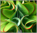
Paper Patterns by timfythetooComment by Melethia: Trading Post comment:
First and foremost, congratulations on the blue and the 7+ score! A lovely composition and very creative use of paper. Needless to say, I think it met the challenge. What interests me most is the post processing - I like the use of blur here, and the changing of the background color is very intriguing. I actually prefer the composite with the different background colors - looks like a Warhol kind of thing. On the "I'd probably have given this a 7" side of things, this strikes me more as graphic art than a photograph. I've no doubt it would sell very well as a stock photo/graphic art piece and you may want to look into that. But my favorite photograph on your top row is still your first Kermie, with your second Santa Maria very closely behind it. |
| Photographer found comment helpful. |
| 07/13/2006 09:38:49 PM |
Double Breakby timfythetooComment by Melethia: Trading Post comment:
For a "I don't know what I'm doing" shot, this finished pretty darn well. I think the simple, balanced composition, the crisp colors, and the very clean lines create a very pleasing picture of fireworks, but what sealed the deal was the red center in the green burst and how well that complimented the other burst. Good job with the PP, too. |
| Photographer found comment helpful. |
| 07/13/2006 02:53:44 PM |
|
| Photographer found comment helpful. |
Home -
Challenges -
Community -
League -
Photos -
Cameras -
Lenses -
Learn -
Help -
Terms of Use -
Privacy -
Top ^
DPChallenge, and website content and design, Copyright © 2001-2026 Challenging Technologies, LLC.
All digital photo copyrights belong to the photographers and may not be used without permission.
Current Server Time: 07/26/2026 01:55:07 AM EDT.