| Image |
Comment |
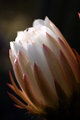
| 05/08/2007 11:31:20 PM |
Cactus Flowerby twmaxComment by annig: aww, really nice! I love the tones of the bloom and the boke.. the only thing I don't like is the small hole (or is it a bug?) in the back petal, and you can't control that. I know close to squat about Photoshop but I bet there are folks who would know how to clone that out... |
 Photographer found comment helpful. Photographer found comment helpful. |
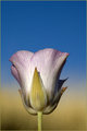
| 05/08/2007 11:28:53 PM |
In The Golden Grassby twmaxComment by annig: Tom, this is really nice, I think the colors of the blue & gold are delightful together, with the blush of lavender in the petals. Are you doing a 2-toned background with PS or are you deliberatly (sp?) composing your macros in a this fashion? I notice a few of them are similar in that way. I like the frame on this too, gives it a nice polished finish! strong work! |
| Photographer found comment helpful. |
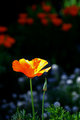
| 05/08/2007 11:24:45 PM |
California Poppyby twmaxComment by annig: Tom: this is really cool! I think the colors are great & I agree with Jutilda, the boke gives makes it seem like a painting! nice... |
| Photographer found comment helpful. |
| 04/29/2007 07:09:03 AM |
|
| Photographer found comment helpful. |
| 04/27/2007 08:14:26 AM |
|
| Photographer found comment helpful. |
| 04/26/2007 08:11:17 PM |
SLEEP...It's Overrated!by twmaxComment by Ann: I can't argue with a picture of one of my favorite subjects...The big stuff is all pretty well done. The image is properly exposed, in focus, although it could be sharpened better, and the composition is well balanced. Where it's going to lose points is on the details. A black background is probably not the best choice to back up the coffee beans or the black parts of the coffeepot, because they fade into the background. The rest of the room is reflected off the metal parts of the coffeepot. The last thing is that the glass coffeepot can be lit better to show off the glass (get a copy of Light, Science and Magic from the library, and read the glass chapter). These are all little things, but together, they'll take at least a full point off your final score.
Wow, I really got wordy. Sorry about that. |
| Photographer found comment helpful. |
| 04/23/2007 04:32:51 PM |
|
| Photographer found comment helpful. |
| 04/23/2007 03:05:46 AM |
SLEEP...It's Overrated!by twmaxComment by alreadythere: composition is weighted too heavily toward the left, i think. also, boo on words -- they diffuse any subtext the image might have had. if you're going for the "sleep is for the weak" theme, there are more metaphoric ways of going about it (but then again, they probably wouldn't have fit with the challenge theme). |
| Photographer found comment helpful. |
| 04/17/2007 09:33:55 PM |
|
| Photographer found comment helpful. |
| 04/12/2007 09:06:12 AM |
|
| Photographer found comment helpful. |
Home -
Challenges -
Community -
League -
Photos -
Cameras -
Lenses -
Learn -
Help -
Terms of Use -
Privacy -
Top ^
DPChallenge, and website content and design, Copyright © 2001-2026 Challenging Technologies, LLC.
All digital photo copyrights belong to the photographers and may not be used without permission.
Current Server Time: 07/16/2026 11:35:50 PM EDT.