| Image |
Comment |
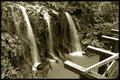
| 06/02/2007 08:35:39 PM |
fallsby rider808Comment by pcody: It's a shame those pieces of timber are in the frame. What an exciting place to be, but to me, the wood just spoils the whole picture. Maybe it's my monitor, but the toning looks a bit greenish, and while I can understand the choice, I don't like it. That is just a personal preference, though. I keep thinking how it would look if you had stood on one of the boards. |
 Photographer found comment helpful. Photographer found comment helpful. |
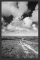
| 06/02/2007 08:16:00 PM |
offroadby rider808Comment by pcody: same as Matt. I don't really find this interesting. It would be more interesting with a human in the frame. The gray border looks off color compared with the picture. |
| Photographer found comment helpful. |
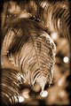
| 06/02/2007 08:10:58 PM |
dripping fernby rider808Comment by pcody: And to offer an opposing viewpoint, I really like everything about this. The bright bokeh spots only add tension to the composition. They suggest heat and that is reinforced by the drooping posture of the ferns. It's almost like they're sweating from the heat. I like the color, again backing up the idea of heat.
Well, there is one thing I see that could be improved. There is a gray area over on the left center of the frame. I'd drop the art frame. It's strong enough to stand without an added frame. |
| Photographer found comment helpful. |
| 06/02/2007 08:05:31 PM |
offroadby rider808Comment by MattO: I'm not a landscape guy, but I dont see anything in this photo that draws my attention. I cant find a single point of interest to keep me looking at it. Your Horizon is also just off a touch. PP needs a bit more contrast as well. Overall this doesnt do much for me. |
| Photographer found comment helpful. |
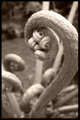
| 06/02/2007 08:02:59 PM |
swan fernby rider808Comment by pcody: It looks like a weird swan. I like the toning and the details of the head and the dof. Just a couple of things might improve it, imo. The blown out area on the top and the crop. I would have tried to get the full curve of the stem in the frame. I like the curls on the bottom so maybe step back just a tad to be able to get both the bottom and stem more fully into the frame. The blown out area only forces the eyes to see the two light straight things in the background which don't really go with the nice curves in the rest of the frame. |
| Photographer found comment helpful. |
| 06/02/2007 08:02:52 PM |
fallsby rider808Comment by MattO: I think a lower perspective to remove the distracting foreground would help. I actually like the tone and feel of this, I wish it had just a touch more contrast to it though. I think your SS is just about right.
|
| Photographer found comment helpful. |
| 06/02/2007 07:56:51 PM |
dripping fernby rider808Comment by MattO: Ok you want me to tear it? Actually I'll just point to what I do like and dont like.
First the highlights seem way to bright. The composition is too centered. I dont like the sepia conversion, I do like the border and think that with a different crop and color maybe strong black and white conversion you have something here. The bokeh just doesnt do it for me with all the hot spots that take away from the main subject. My eyes keep bouncing to the background away from the subject.
|
| Photographer found comment helpful. |
Home -
Challenges -
Community -
League -
Photos -
Cameras -
Lenses -
Learn -
Help -
Terms of Use -
Privacy -
Top ^
DPChallenge, and website content and design, Copyright © 2001-2026 Challenging Technologies, LLC.
All digital photo copyrights belong to the photographers and may not be used without permission.
Current Server Time: 06/20/2026 11:08:05 PM EDT.