| Image |
Comment |
| 06/14/2006 12:51:37 AM |
|
 Photographer found comment helpful. Photographer found comment helpful. |
| 06/13/2006 08:24:36 PM |
Martini Greenby scarbrdComment by zardoz: A superbly crafted image! Tremendous impact.
I find the absence of an opposing thumb slightly disturbing (clearly I am easily disturbed) even though I know by logic that the image is correct and the thumb is simply too low to see. This is very trivial and only crept up on me after several seconds - but now it wont go away ... arrgghh. Where are my pills, I need to lay down. |
| Photographer found comment helpful. |
| 06/13/2006 04:22:31 PM |
|
| Photographer found comment helpful. |
| 06/13/2006 01:55:04 PM |
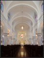
Architecture III Take IIby scarbrdComment by LevT: I agree with you that a person would furhter improved this already good photo. I think it should definitely have been a solitary worshiper sitting somewhere on the benches relatively close to the camera. It would add a human element and also add a pleasant "symmetry breaking" to the shot. In the original shot, the person was blocking the altar and was too symmetrically located. Also, her pose was not exactly what you would expect in a church. |
| Photographer found comment helpful. |
| 06/13/2006 09:52:46 AM |
|
| Photographer found comment helpful. |
| 06/13/2006 02:08:16 AM |
Architecture III Take IIby scarbrdComment by Art Roflmao: Correction to the original photo reference in your notes:
//www.dpchallenge.com/image.php?IMAGE_ID=339006

FWIW, I think BOTH are awesome! If a human subject would add interest, it would be someone swinging from one of the lights - THAT would make it perfect! :) |
| Photographer found comment helpful. |
| 06/12/2006 10:01:12 PM |
|
| Photographer found comment helpful. |
| 06/12/2006 10:00:19 PM |
Architecture III Take IIby scarbrdComment by yanko: I like the improvements you've made here. This one does look better. I like how I can see more of the benches although I think you could have made them even brighter by dodging them just a bit. I also like the crop. It seems to make the church ceiling look higher than the original did. Removing the person also makes a big difference, however I think the problem in the original with that was who the person was. I bet if she was an old fragile looking woman it would have worked but with the younger one in that pose it made it look like a tourist photo. |
| Photographer found comment helpful. |
| 06/12/2006 06:55:54 PM |
Architecture III Take IIby scarbrdComment by Neuferland: scarbrd, right? Nice, very nice improvement. Got rid of the distraction in the aisle and the composition is much better in this one. I like the feel of the shot overall. The only thing that bothers me betweent this one and the original is the original looked a bit brighter and whiter. But otherwise, much better. I would have given the original a 5, this one gets a 7 for improvement and just cuz it deserves it! ;) |
| Photographer found comment helpful. |
| 06/12/2006 04:42:20 PM |
|
| Photographer found comment helpful. |
Home -
Challenges -
Community -
League -
Photos -
Cameras -
Lenses -
Learn -
Help -
Terms of Use -
Privacy -
Top ^
DPChallenge, and website content and design, Copyright © 2001-2026 Challenging Technologies, LLC.
All digital photo copyrights belong to the photographers and may not be used without permission.
Current Server Time: 06/12/2026 08:47:36 AM EDT.