| Image |
Comment |
| 02/11/2003 10:16:41 PM |
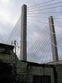
Rising Tallby timj351Comment by crabappl3: Critique Club Comment:
Excellent contrast between old and new. The straight lines of the bridge and the earthy brick below really make for a great feeling of how man progresses and leaves the old behind to make room for the new. Your exposure is real good, you have enough light in the foreground to make out details, but not so much as to washout the background. The clouds in contrast to the darker stone work adds another nice element to the shot. Due to your vantage point there isn't much you can do about the pole with wires other then just crop the whole thing out. This would have left you just the two main poles and the brickwork below. The biggest concern if you had done that is that you may loose the before and after feel of the shot.
I really like how the bridge 'grows' from the old. You have presented a strong image. |
| 02/11/2003 05:45:01 PM |
Heaven Boundby timj351Comment by mariomel: I like this picture's perspective so it matches the challenge well, but seems to me that the artifacts are a little too noticeable. Maybe too much USM or just a nasty side effect from the squares. |
| 02/10/2003 10:31:27 PM |
|
| 02/10/2003 09:24:05 PM |
|
| 02/10/2003 09:05:44 PM |
|
| 02/10/2003 06:46:35 PM |
Heaven Boundby timj351Comment by Jacko: Very beautiful angles. I love it. Good choice with the black and white. Works very well. I like how the sky is washed out. Good luck. 8 |
| 02/10/2003 05:37:39 PM |
|
| 02/10/2003 11:49:14 AM |
Heaven Boundby timj351Comment by jmsetzler: This is an incredibly strong perspective shot.. the black and white forces the viewer to look at the shapes and lines... great work :) = 10 - setzler |
| 02/08/2003 12:48:12 PM |
Rising Tallby timj351Comment by lisae: Beautiful. The composition of this is really effective. The buildings down below may seem a little bit dimly lit, but that actually works given the theme of the new structure towering over the ruins of the old one. |
| 02/06/2003 11:29:53 PM |
Mariners Fanby timj351Comment by Cub: Nice photo! Good colors and focus. Some would complain of the "Rule of Thirds" violation but it doesn't bother me. In fact I think it is necessary for the background... Cub |
Home -
Challenges -
Community -
League -
Photos -
Cameras -
Lenses -
Learn -
Help -
Terms of Use -
Privacy -
Top ^
DPChallenge, and website content and design, Copyright © 2001-2026 Challenging Technologies, LLC.
All digital photo copyrights belong to the photographers and may not be used without permission.
Current Server Time: 07/18/2026 06:01:56 PM EDT.