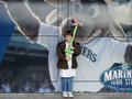
DPChallenge: A Digital Photography Contest You are not logged in. (log in or register
 
Browse Settings
Currently viewing:
Membertimj351

Show comments:

Per page:

Order:

Comments:


Comments Received by timj351
Pages:   ... [63] [64] [65] [66] [67] [68] [69] ... [177]
Showing 651 - 660 of ~1765
Image Comment
Sunrays
02/24/2003 08:32:43 PM
Sunrays
by timj351

Comment by joanns:
Lovely, crisp & clear photo. I love the sun rays. Lovely.
Photographer found comment helpful.
Sunrays
02/24/2003 07:25:15 PM
Sunrays
by timj351

Comment by albright1:
Perfect for a nature calendar or a postcard. What a glorious sky.
Photographer found comment helpful.
Sunrays
02/24/2003 03:38:15 PM
Sunrays
by timj351

Comment by justine:
Not bad. Maybe more cropped off the top, but this works. Nice job.
Photographer found comment helpful.
Heaven Bound
02/18/2003 03:00:23 AM
Heaven Bound
by timj351

Comment by briphoto:
This photo makes me want to tilt my head to adjust to the perspective of it, the photo forces me to rethink perspective. I feel maybe it is a little too light at the top, though you might have been intending that, judging from the title. Good focus. I like your choice to make it a black and white. Overall, I think you didn't get the score you deserved, but not by much.
Mariners Fan
02/16/2003 08:58:37 PM
Mariners Fan
by timj351

Comment by stephan:
Greetings from the Critique Club, Tim.

Composition: Not so good. The only positive element I can see are some lines guiding the viewers eye to your subject. But there are more elements I don't like. Primarily the background which is competing with your subject. I also would like to see either the whole logo or not at all. The centered subject placement makes this photo looking like a generic family photo album photo. Maybe that was your intent (regarding the challenge theme) but it's boring.
Pesonally I would have placed your niece more to the left, under the arm of the elk mascot and cut the logo.

Lighting: It probably was overcast so the lighting looks very flat. This also makes the photo look boring. The difference of the lighting conditions in the background photo and on your subject is a bit strange. They don't "fit" together.
The brighter "band" of reflection on top of the photo is distracting.

Focus: The focus is ok. Everything is in the same focus. I can't see anything bad but also nothing good on that.

Challenge: Yes. This is a cliche subject, photographed in a very cliche manner (family photo album style).

Creativity: I'm a bit torn apart. On the one hand I can't see much creativity here. It really looks like a photo you made for your family. There is nothing technically and on your subject which makes me (as not a member of your family) want to look at it for some longer time.
On the other hand the challenge theme was "cliche" and maybe you did all this on purpose. Maybe you did on purpose a non-special composition, lighting and focus and chose this subject. Well, this would be really interesting to know. Unfortunately you didn't say anything about your intent in the photographer's comments.

Overall Opinion: To be honest, I was really surprised to see that this photo was made by you. I mean I counted 9 ribbons you achieved and you regularly score above 6 but this really just looks like a private snapshot to me. As described above it would be interesting to know if that was your intent. It wouldn't make the photo more interesting to me but at least I would understand it. ;-)
Heaven Bound
02/13/2003 05:34:14 PM
Heaven Bound
by timj351

Comment by Swashbuckler:
Solid focus and a nice amount of contrast. Good patterns. Ouchy glare on the sky part. 7 Swash
Heaven Bound
02/13/2003 06:55:10 AM
Heaven Bound
by timj351

Comment by lisae:
Beautiful. What can I say? This is a breathtaking work of art. 10.
Heaven Bound
02/12/2003 09:11:35 PM
Heaven Bound
by timj351

Comment by ChrisW123:
I really like it that the left side of the building is horizontal in the pic and the right side is almost verticle. Excellent perspective!! And the lighting is very nice also. 9.
Heaven Bound
02/12/2003 09:03:39 AM
Heaven Bound
by timj351

Comment by CreativeFlyPhoto:
i like the angle you chose ... as you get to the top it does get a little blown out - but it fits this iamge nicely
Heaven Bound
02/12/2003 12:17:11 AM
Heaven Bound
by timj351

Comment by kandyj:
GReat shot. Love the way the buildings almost fade into the sky. 9
Pages:   ... [63] [64] [65] [66] [67] [68] [69] ... [177]
Showing 651 - 660 of ~1765


Home - Challenges - Community - League - Photos - Cameras - Lenses - Learn - Help - Terms of Use - Privacy - Top ^
DPChallenge, and website content and design, Copyright © 2001-2025 Challenging Technologies, LLC.
All digital photo copyrights belong to the photographers and may not be used without permission.
Current Server Time: 09/28/2025 08:36:11 AM EDT.