| Image |
Comment |
| 06/15/2003 03:43:03 PM |
Skid Finby timj351Comment by brumos: Good action shot. nice contrast of colours also. A better title (eg. Powerboat or Hydrocraft Racing) would have made this a real magazine cover. 8. |
| 06/13/2003 08:45:58 AM |
Skid Finby timj351Comment by gaja_tz: you should crop more on the left side, because it is moving to the right side. = 5 |
| 06/13/2003 02:17:52 AM |
Skid Finby timj351Comment by Musicman: This would have also work for sound challenge. The emphassis seems to be on the water trail. The boat seems a little distant. |
| 06/12/2003 09:36:21 AM |
Skid Finby timj351Comment by sagestudio: I like the little spots of light on the water. There's a lot of action here, which I'm sure would do well as a cover. I'm not sure if I like the tilted horizon though, I'm sure that was an artistic choice, and it does give this more movement. |
| 06/11/2003 12:52:00 AM |
|
| 06/08/2003 10:31:58 PM |
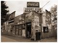
Signs of the Timesby timj351Comment by karmat: CRITIQUE CLUB CRITIQUE
by karmat
As I mentioned before, I think this works very well in the "duotone mode." Though I acknowledge the other comments about how colorful the signs would be, I still think shooting this in color would lose a lot of character and depth. I think it would make it raucous and busy.
By using the tones as you have, it does give it a vintage feeling. Looking at this picture makes it seem as if I have stepped back in time somehow, and am looking at the corner store for a small town near here.
My only complaint (and I had to look a while to figure this out) is that the cropping feels unbalanced to me. I think that since the end of the building, per se, can be seen on the left, it may give more of a sense of balance (at least for me) if it wasn't "chopped' on the right. Or conversely, crop it slightly tighter on the right.
Again, I think this is a very well done shot, and I apologize for not being able to offer more "help" with it. I enjoy your work.
karmat |
| 06/06/2003 07:04:34 AM |
|
| 06/01/2003 11:03:09 PM |
Signs of the Timesby timj351Comment by frisca: this is fabulous. I love the excess of signs and the perspective on this store. It looks as if the thing is tilting over too. :) |
 Photographer found comment helpful. Photographer found comment helpful. |
| 06/01/2003 05:48:40 PM |
Signs of the Timesby timj351Comment by qachyk: If it weren't for the prices, this would look entirely like an old picture of an old general store, which is neat -- and presumably the idea. Good job on making it look very old-photograph. |
| Photographer found comment helpful. |
| 06/01/2003 07:36:05 AM |
|
Home -
Challenges -
Community -
League -
Photos -
Cameras -
Lenses -
Learn -
Help -
Terms of Use -
Privacy -
Top ^
DPChallenge, and website content and design, Copyright © 2001-2026 Challenging Technologies, LLC.
All digital photo copyrights belong to the photographers and may not be used without permission.
Current Server Time: 07/17/2026 10:45:01 PM EDT.