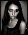
Rorschach 's Babyby
Blue MoonComment by dr rick: Greetings from the Critique Club.
A creative idea, executed quite well. The composition is ambiguous. The melange of hands in the center wants to be the focal point since it's lighter and framed by shadow, but it's out of focus and dead center, so the noses compete with it (and each other) for being the focal point. This leaves the viewer somewhat confused, which would be very bad for most photos but works very well here. The ambiguity gives it the "interesting/disturbing" feeling that caught your attention and makes the photo work.
The very subtle tint and the nice gradations are not what one would expect in an inkblot, which is strictly black and white. But this isn't an inkblot; it's just a photo suggestive of one, and these elements bring it to life. Well done.
I don't think the white top and bottom only frame works very well. At least make it go all the way around, but I'd rather not see a frame at all here. And the sleeve is so bright it's distracting; a light gray would be better, and something with a subtle texture would be a plus.
There is a fuzziness around the eyelashes that looks like jpeg artifacts, although it could be a side effect of one of the other filters you used. It isn't really noticable, and I only bring it up because of your question about what caused the lines on the nose; it may have been the same thing. Ideally, jpeg should only be used by the camera (be sure to use the highest quality) and for the final product; always use a non-lossy format for all intermediate steps, such as transferring to/from neatimage. (And if you're using the free demo version of neatimage, that's probably the problem; it only supports low quality jpeg output.)
But intriguing as this photo is when first exploring it, it doesn't have the appeal to attract viewers again and again (although I can really only speak for myself here). But it was fun to critique it, and I'm glad I had that opportunity.