| Image |
Comment |
| 06/20/2003 06:01:14 PM |
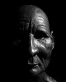
Dignityby PaulkComment by ellamay: I am curious as to what this is. Is it a sculpture or a mask of sorts? I like the lighting on it. |
 Photographer found comment helpful. Photographer found comment helpful. |
| 06/20/2003 02:41:24 PM |
Dignityby PaulkComment by Kali: This picture makes me wish I was a paying member just so I could vote. :( At least I can comment... Very nice ;) I really like the leatheryness of his face. Don't know if I woulda called it 'Dignity' tho... |
| Photographer found comment helpful. |
| 06/20/2003 09:07:55 AM |
Dignityby PaulkComment by Luckydog: This is a great shot!!!
I never found out how to do this "black on black" thing but now i need to find out.
Best of luck in the challenge, i'm sure you will do well, and i look forward to seeing a ribbon under this picture in a few days time. |
| Photographer found comment helpful. |
| 06/20/2003 03:05:12 AM |
Dignityby PaulkComment by RiderGal: Interesting... hard to tell if this is an old man, or a mask. I really like it. The eyes kind of bother me, I wish I could see them more, they look so sunken and eerie. I think in this case I would have actually liked to have seen more of the left side of the face, it is almost too black, but I guess thats the challenge. Awesome texture here! -8- |
| Photographer found comment helpful. |
| 06/20/2003 02:15:46 AM |
|
| Photographer found comment helpful. |
| 06/20/2003 01:50:28 AM |
Dignityby PaulkComment by dacrazyrn: Very interesting. Almost thought it was a real face. slight blown area on the nose but nice shot 7 |
| Photographer found comment helpful. |
| 06/17/2003 10:33:53 PM |
|
| Photographer found comment helpful. |
| 06/17/2003 05:47:53 PM |
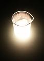
New Scientistby PaulkComment by K-Rob: That's a pretty good effect. It seems over exposed though because the white is REALLY white. That may have been your intent though. |
| Photographer found comment helpful. |
| 06/17/2003 06:55:11 AM |
New Scientistby PaulkComment by prhorton: Like a bottomless pitt, great magazine cover. Right to the point and nothing to fault. Great image. |
| Photographer found comment helpful. |
| 06/17/2003 04:43:46 AM |
New Scientistby PaulkComment by gaja_tz: light is very high. you should be using smaller aperture and higher shutter speed, because bottom is blown away. |
| Photographer found comment helpful. |
Home -
Challenges -
Community -
League -
Photos -
Cameras -
Lenses -
Learn -
Help -
Terms of Use -
Privacy -
Top ^
DPChallenge, and website content and design, Copyright © 2001-2026 Challenging Technologies, LLC.
All digital photo copyrights belong to the photographers and may not be used without permission.
Current Server Time: 07/17/2026 03:06:51 AM EDT.