|
|
Comments Received by Qiki
|
Showing 451 - 460 of ~880 |
| Image |
Comment |
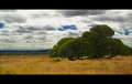
| 02/06/2009 08:58:18 AM | Prelude to a Stormby QikiComment by spiritualspatula: Hello from the Critique Club!
Initial impression from this shot is the stark contrast between the green of the tree and the brownish yellow of the grass. This makes the tree pop from the foreground well. I think the use of
a polarizer was wise, because the dark blue where the sky is present is a nice addition. The color and saturation of the entire scene is great, but I might have considered lightening the dark areas of the tree a bit, myself. You did a nice job of capturing the varying amounts of light, and the clouds have a
nice amount of contrast to them. There is a small area in clouds, upper left, that looks a bit overexposed, but it is rather insignificant. Several comments allude to your tree being cropped, but on a closer look, it appears that you included the entire tree that is your subject, and that it is background trees that look cropped. That is somewhat distracting, not only because it looks cropped, but also because your subject doesn\'t separate from the background. I assume this only happened because of the spacing of the trees, since you carefully included
the entire tree otherwise. I like the choice of your subject- the way it sprawls along the ground is interesting. Your score may have suffered a bit for the thicker borders, given the increasing displeasure with borders lately. My opinion is that it is a bit thick, but not overwhelmingly so. Lastly, I would associate the title you chose with more ominous cloud cover. This looks like it might be the front part of a warm front, and thus a storm would be somewhat nearby, but your title choice makes me think of more imminent changes.
Personally, I like this image a good deal, and would have assumed a bit higher score than the end result. |  Photographer found comment helpful. Photographer found comment helpful. |
| 01/30/2009 10:16:16 PM | Prelude to a Stormby QikiComment by J-Me: Beautiful textures between the grass and the sky, the roughness of the grass and the soft texture of the clouds. Makes one want to rest under that tree on a hot day! | | Photographer found comment helpful. |
| 01/29/2009 08:42:09 PM | Prelude to a Stormby QikiComment by qui-bow: Beautiful. One of my favorites so far. Everything from the framing to the colors to the subject. I love it!! | | Photographer found comment helpful. |
| 01/26/2009 09:00:22 PM | | | Photographer found comment helpful. |
| 01/26/2009 02:29:19 PM | Prelude to a Stormby QikiComment by wingwham: The tree is slightly cropped. I like the picture, and i understand that the composition is better with the tree where it is, but you could have edited the tree a bit. Clone the sky and background to try and make your main subject whole. Other than that, good colors, nice picture. 6 | | Photographer found comment helpful. |
| 01/26/2009 01:03:21 PM | | | Photographer found comment helpful. |
| 01/26/2009 09:46:19 AM | | | Photographer found comment helpful. |
| 01/26/2009 08:00:34 AM | | | Photographer found comment helpful. |
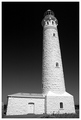
| 01/21/2009 10:12:30 AM | Lighthouse Perspectiveby QikiComment by Bear_Music: What I wanted to say: as far as capturing the tonalities of the white stonework, the lighting and processing here are simply outstanding. And the sky is quite beautiful, very rich and strong and Anselish.
Compositionally, unfortunately, it's another story. The whole composition feels cramped, there's no sense of space and dimension. The convergence is a bit much; one wishes it had been possible (was it?) to step backwards a considerable distance and regularize things a bit. As far as replicating Ansel goes, of course he had a view camera to deal with stuff like that, but the convergence in any case isn't something he's have allowed, or not to such a degree.
Photoshop actually allows a great deal of latitude for correcting perspective with the skew and perspective controls in the edit menu: here's a quick example of what's possible:
 and a revised version 2 with height more retained: 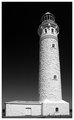 .
So, I love the luminosity of it, the processing of it is very pure, but the composition is way too tight for me and the convergence is just too extreme for my tastes. I could handle it on the tower, actually, but not on the base structure.
ETA: Looking back now I see that I could have kept a bit of the stretch, the base structure looks a bit squat now doesn't it? But you can see the possibilities are there. Revised edit posted above. Message edited by author 2009-02-06 21:36:16. | | Photographer found comment helpful. |
| 01/21/2009 07:43:34 AM | | | Photographer found comment helpful. |
|
Showing 451 - 460 of ~880 |
Home -
Challenges -
Community -
League -
Photos -
Cameras -
Lenses -
Learn -
Help -
Terms of Use -
Privacy -
Top ^
DPChallenge, and website content and design, Copyright © 2001-2026 Challenging Technologies, LLC.
All digital photo copyrights belong to the photographers and may not be used without permission.
Current Server Time: 06/26/2026 12:57:20 PM EDT.
|