DPChallenge: A Digital Photography Contest You are not logged in. (log in or register
 
Challenge Entries
Portfolio Images
This image is not part of a public portfolio.
Lighthouse Perspective
Qiki


Photograph Information Photographer's Comments
Challenge: Ansel Adams II (Advanced Editing VII*)
Camera: Pentax *ist DL
Lens: Sigma 18-200mm f/3.5-6.3 DC for Pentax
Location: Cape Leeuwin. Western Australia.
Date: Jan 16, 2009
Aperture: f/11
ISO: 400
Shutter: 1/350
Galleries: Black and White
Date Uploaded: Jan 18, 2009

Cape Leeuwin Lighthouse, located on the most south westerly tip of Australia at the point where the Indian and Southern Oceans meet.

Shot with a polarizing filter which darkened the sky without the need for any help in PP. Rotated and cropped slightly. Cloned sensor dust and a hot pixel. Desaturated. Adjustments to curves. Resized and added border. USM.

Statistics
Place: 78 out of 219
Avg (all users): 5.6722
Avg (commenters): 6.3333
Avg (participants): 5.4824
Avg (non-participants): 5.7756
Views since voting: 890
Views during voting: 370
Votes: 241
Comments: 3
Favorites: 0


Please log in or register to add your comments!

AuthorThread
 Comments Made During the Challenge
01/21/2009 10:12:30 AM
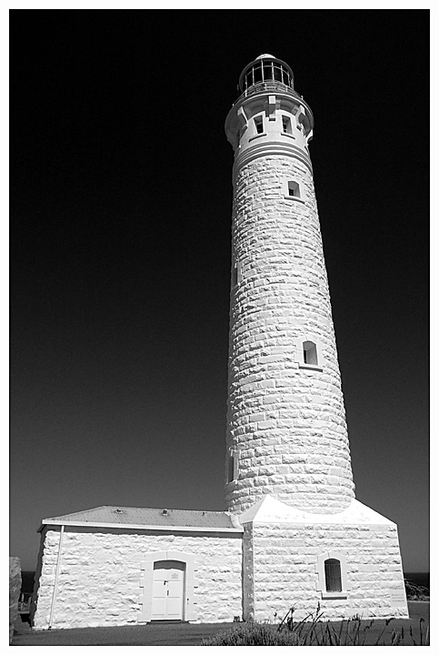
What I wanted to say: as far as capturing the tonalities of the white stonework, the lighting and processing here are simply outstanding. And the sky is quite beautiful, very rich and strong and Anselish.

Compositionally, unfortunately, it's another story. The whole composition feels cramped, there's no sense of space and dimension. The convergence is a bit much; one wishes it had been possible (was it?) to step backwards a considerable distance and regularize things a bit. As far as replicating Ansel goes, of course he had a view camera to deal with stuff like that, but the convergence in any case isn't something he's have allowed, or not to such a degree.

Photoshop actually allows a great deal of latitude for correcting perspective with the skew and perspective controls in the edit menu: here's a quick example of what's possible:

and a revised version 2 with height more retained: .

So, I love the luminosity of it, the processing of it is very pure, but the composition is way too tight for me and the convergence is just too extreme for my tastes. I could handle it on the tower, actually, but not on the base structure.

ETA: Looking back now I see that I could have kept a bit of the stretch, the base structure looks a bit squat now doesn't it? But you can see the possibilities are there. Revised edit posted above.

Message edited by author 2009-02-06 21:36:16.
  Photographer found comment helpful.
01/21/2009 07:43:34 AM
nice contrast captured here, excellent processing IMO. 7
  Photographer found comment helpful.
01/21/2009 02:59:40 AM
Great structure! I wish the stonework on the lower structures had a bit more detail on it.
  Photographer found comment helpful.


Home - Challenges - Community - League - Photos - Cameras - Lenses - Learn - Prints! - Help - Terms of Use - Privacy - Top ^
DPChallenge, and website content and design, Copyright © 2001-2024 Challenging Technologies, LLC.
All digital photo copyrights belong to the photographers and may not be used without permission.
Current Server Time: 04/24/2024 07:01:28 PM EDT.