| Image |
Comment |
| 01/22/2003 07:57:22 AM |
|
 Photographer found comment helpful. Photographer found comment helpful. |
| 01/21/2003 11:47:53 PM |
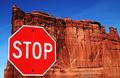
Red Rock, Red Stopby YomiComment by Lustre: Wow - that's certainly an interesting place to find a STOP sign. Your colouring and focus is brilliant - so much detail. The sign is also "crispy clear". My only (possibly) negative comment would be the alignment of the left edge of the rock and stop sign - perhaps more or less overlap between the two would be better? |
| Photographer found comment helpful. |
| 01/21/2003 05:17:48 PM |
|
| Photographer found comment helpful. |
| 01/21/2003 04:39:09 PM |
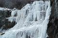
Wall of Winterby YomiComment by indigo997: HEY! I'm from Utah originally. That looks really cold.
The ice formation is really cool, but I agree that the perspective isn't the best. I suppose there is probably some sort of pool or something that prevents you from getting really good angles though. I'd also like to see more of the surroundings just for comparison. I like that you've filled up the frame, but it's often hard to judge how good the crop is without knowing what the photographer was dealing with. It feels like the bottom has been cut off a little too much.
Ice and snow can be an exposure nightmare, and you've done a fairly good job with it. There are a few "hot" spots on the ice, but not bad. This photo is still color, right? It looks almost B&W except for that one patch of grass. Since the color isn't adding much anyway, you might try changing it to B&W and then doing some quadtones to see what other looks you come up with. The B&W just feels a little dead to me and doesn't add to the coldness IMO. Maybe a blue cast or something would work. You did a great job of finding an interesting subject and, without being there, it's really hard to judge whether or not you could have taken a better shot of it. It would be really cool to have something in this photo for size comparison to actually see how big the fall is. Maybe a person looking up at it? Again, not sure what's possible since I haven't been there. Overall, nice shot with very few problems. |
| Photographer found comment helpful. |
| 01/21/2003 03:23:29 PM |
Red Rock, Red Stopby YomiComment by justine: Stunning...bit too saturated for me.......but then I guess it wouldn't of caught my eye as much. This is a good job. |
| Photographer found comment helpful. |
| 01/21/2003 11:22:50 AM |
|
| Photographer found comment helpful. |
| 01/21/2003 06:53:41 AM |
|
| Photographer found comment helpful. |
| 01/20/2003 10:27:10 PM |
|
| Photographer found comment helpful. |
| 01/20/2003 11:54:46 AM |
Red Rock, Red Stopby YomiComment by dodobird: Great idea and flawless execution. I know your subject was red, but I do wonder what a black and white would have done here to help in contrast. The sign "pops" but not huge due to the same hue. At first I didn't like the inclusion of the sky on the left hand side, but now, I think that is what makes the picture work. I like the placement of the sign it is pleasing to the eye, your focus was just excellent everything is just sooo crisp. THere is a small bush in the lower right hand side, but due to the colors it really does not stand out. In fact I didn't notice it till about the tenth time staring at the shot. Great job.10. |
| Photographer found comment helpful. |
| 01/20/2003 10:41:52 AM |
|
| Photographer found comment helpful. |
Home -
Challenges -
Community -
League -
Photos -
Cameras -
Lenses -
Learn -
Help -
Terms of Use -
Privacy -
Top ^
DPChallenge, and website content and design, Copyright © 2001-2026 Challenging Technologies, LLC.
All digital photo copyrights belong to the photographers and may not be used without permission.
Current Server Time: 07/16/2026 04:53:24 PM EDT.