threeby
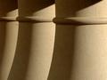
ursulaComment by zeuszen: The crop, so critical for this minimal shot, is quite good.
I have toyed with the possibility to shift that crop (the entire final image) slightly to the left, mainly to slow the flow (eye movement), but remain unsure about a measurerable improvement on what is there.
The emphasis on texture is quite strong, considering that form is the dominant subject (?). The juxtaposition of the single-ringed columns (?) with the angular repeat of light and shadow makes for a satisfying contrast of opposites, while remaining true to a theme.
The slight flaw (top left, edge of centre and left column) is a little distracting, given the perfectionist manner and minimal subject. I see, however, no way of avoiding this within the contest rules.
One of the best entries, IMO, by one with a breath for detail and composition.