| Image |
Comment |
| 08/26/2006 03:33:17 PM |
|
 Photographer found comment helpful. Photographer found comment helpful. |
| 08/26/2006 08:26:17 AM |
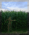
into the cornfieldby posthumousComment by puzzled: I try hard not to comment on frame choices unless I find them really distracting. Unfortunately, I find this frame choice distracting. Sorry. I do think it's a clever idea with the ghost going into the corn field and I feel you met the challenge very well. Also nice job on the sky. |
| Photographer found comment helpful. |
| 08/26/2006 06:38:52 AM |
|
| Photographer found comment helpful. |
| 08/26/2006 04:31:45 AM |
|
| Photographer found comment helpful. |
| 08/25/2006 03:16:23 PM |
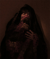
Krypton on Fireby posthumousComment by bucket: how do you expect to score higher if you submit such eccentric work?
( ya, I'm laughing...)
Nice work...love the tones..and more than anything I love that you got comments stating "I'm confused"..
Do something about that would ya... |
| Photographer found comment helpful. |
| 08/23/2006 11:48:16 PM |
|
| Photographer found comment helpful. |
| 08/23/2006 09:01:29 PM |
|
| Photographer found comment helpful. |
| 08/23/2006 04:52:15 PM |
|
| Photographer found comment helpful. |
| 08/23/2006 03:53:26 PM |
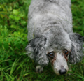
poodlesoftby posthumousComment by talj: There is definitely a nice softness to this image, IMHO composition could be improved, maybe by getting down to the dogs level |
| Photographer found comment helpful. |
| 08/23/2006 12:22:44 PM |
|
| Photographer found comment helpful. |
Home -
Challenges -
Community -
League -
Photos -
Cameras -
Lenses -
Learn -
Help -
Terms of Use -
Privacy -
Top ^
DPChallenge, and website content and design, Copyright © 2001-2026 Challenging Technologies, LLC.
All digital photo copyrights belong to the photographers and may not be used without permission.
Current Server Time: 06/21/2026 08:47:51 AM EDT.